Revamping a Blog to Drive 400% More Traffic to a Gaming Platform
Revamping the Wallet-Codes blog to drive 400% more traffic to the main product website.
WalletCodes
App
Role
Lead UI/UX Designer
Timeline
2 Months
team
2 Enginners, 1 PM, me
platform
Web

As a Lead UI/UX Designer, I took on an exciting challenge: to completely revamp the blog for Wallet-Codes, a leading platform for digital gift cards, game top-ups, and online vouchers. My main goal was clear: transform an underperforming blog into a vibrant content hub that not only engaged users but, more importantly, drove a massive 400% increase in traffic to the main Wallet-Codes product website. This wasn’t just about making the blog look pretty; it was about making it a powerful marketing tool.
Project Overview:
Client: Wallet Codes My Role: Lead UI/UX Designer Tools Used: Figma, Zeplin, Maze Project Duration: 2 Months (covering Discovery, Design, and Usability Testing phases)
Empathize Understanding Who’s Really Visiting
Before touching a single wireframe, I committed to a thorough understanding of the existing audience, what competitors were doing right, and where the old blog was losing people.
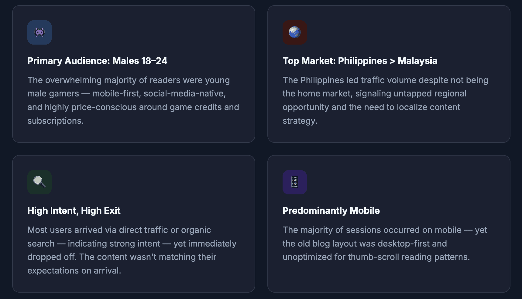
Analytics: Where Users Were (and Where They Ran Away)
I analyzed the old blog’s data comprehensively bounce rates, session duration, device breakdown, and geographic distribution to understand not just what was happening, but with whom and why.

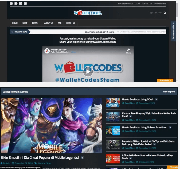
Old Blog Audit : What Wasn’t Working
Before designing anything, I needed to understand exactly why the existing blog was underperforming. An audit of the old Wallet-Codes blog revealed a set of compounding UX and content problems that were collectively killing engagement and sending users away before they could reach the main product site.
Competitor Analysis: What Codashop Got Right
I conducted an in-depth audit of competing gaming content platforms, with particular focus on Codashop’s blog one of the most successful in the region.
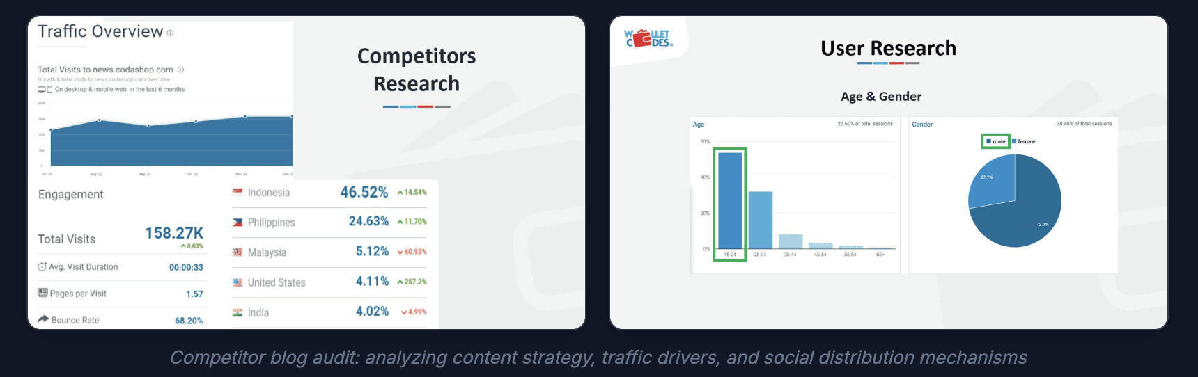
Codashop’s top traffic source was Facebook shares, not organic search. This validated the importance of highly shareable, platform-specific content and pointed to a major gap in Wallet-Codes’ social distribution strategy.
🌐 Industry Trend Social Led Content Distribution in SEA
Across Southeast Asia, Facebook remains the dominant social platform for content discovery, with 87% of internet users in the Philippines and 80% in Malaysia active on the platform (DataReportal 2024). Gaming content that travels via friend shares and Facebook groups consistently outperforms SEO-only strategies for the 18–24 demographic. This insight meant our redesign needed to make social sharing a first-class UX feature, not an afterthought.
User Persona: The Quick Information Seeker
From the research, I developed a primary user persona that grounded every design decision in real human behavior.
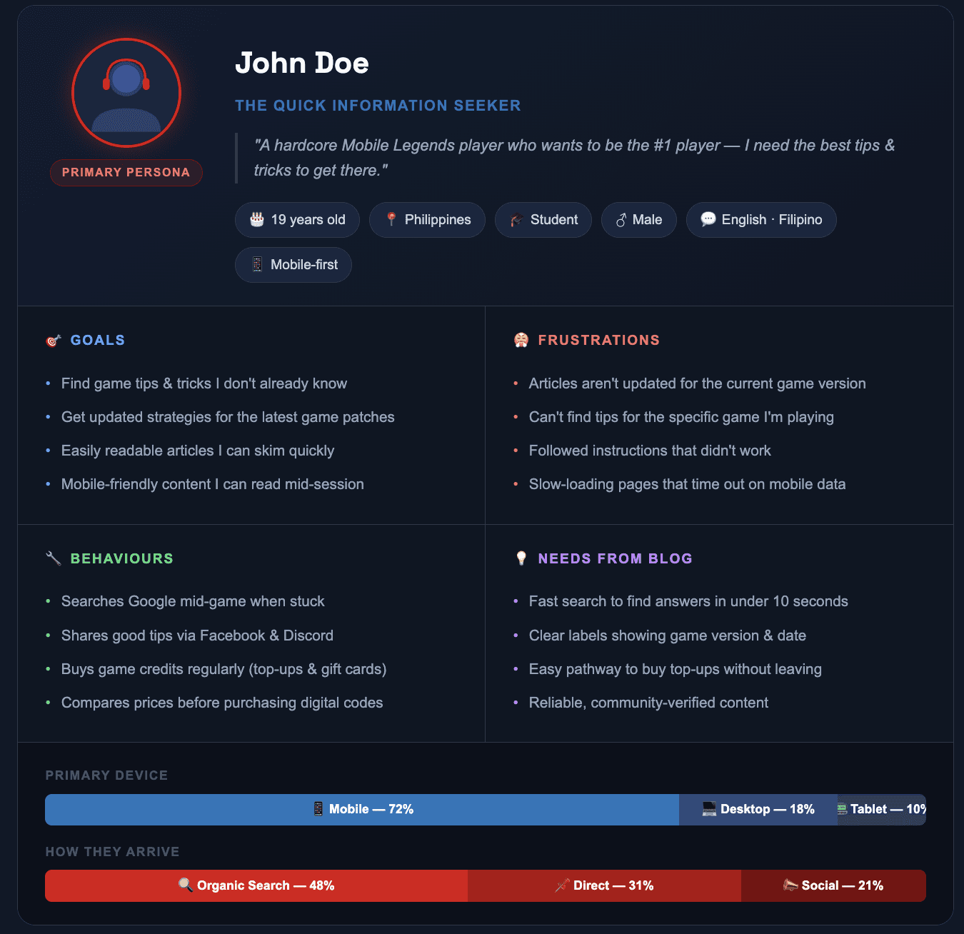
John’s key frustrations — outdated content, poor search, slow load times, and articles that didn’t match his game version — became the direct brief for our redesign priorities.
Mapping the User Journey
I plotted the emotional and behavioral behavior of our primary user, from the moment of frustration through their search for a solution, to how they interacted with blog content.
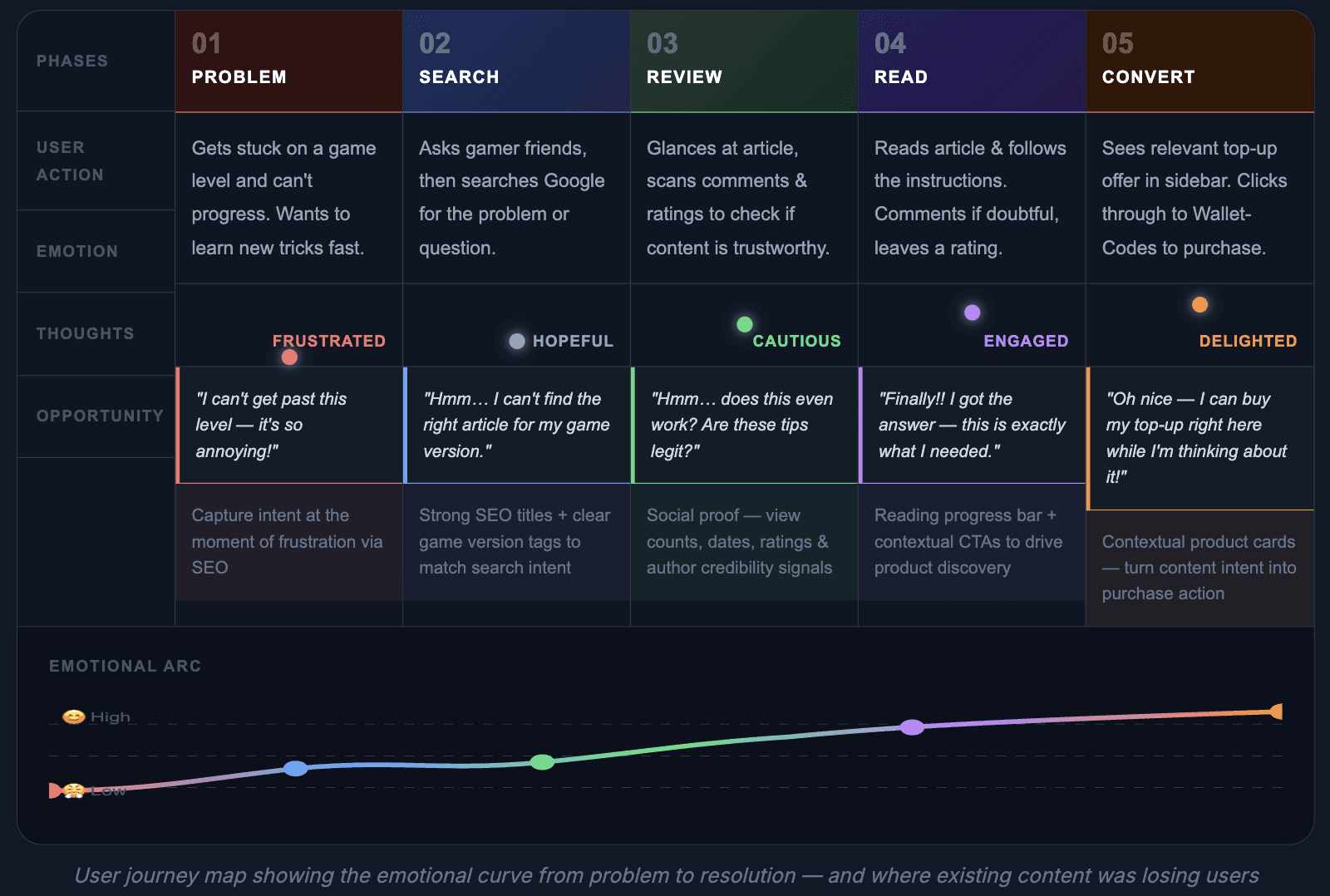
The journey revealed that users arrived with high frustration and equally high motivation but the old blog killed that momentum with poor content relevance and no clear pathway to the next step.
Define Framing the Problem as Opportunity
With a deep understanding of our users and the content landscape, I refined the core problems we needed to fix.
Collaborative Goal Setting and Problem Framing:
Early in this phase, I facilitated several brainstorming sessions with relevant PICs (Persons In Charge) from Wallet-Codes, including marketing, content, and product team representatives. In these sessions, we collectively:
Decided on clear project goals, particularly the ambitious 400% traffic increase target.
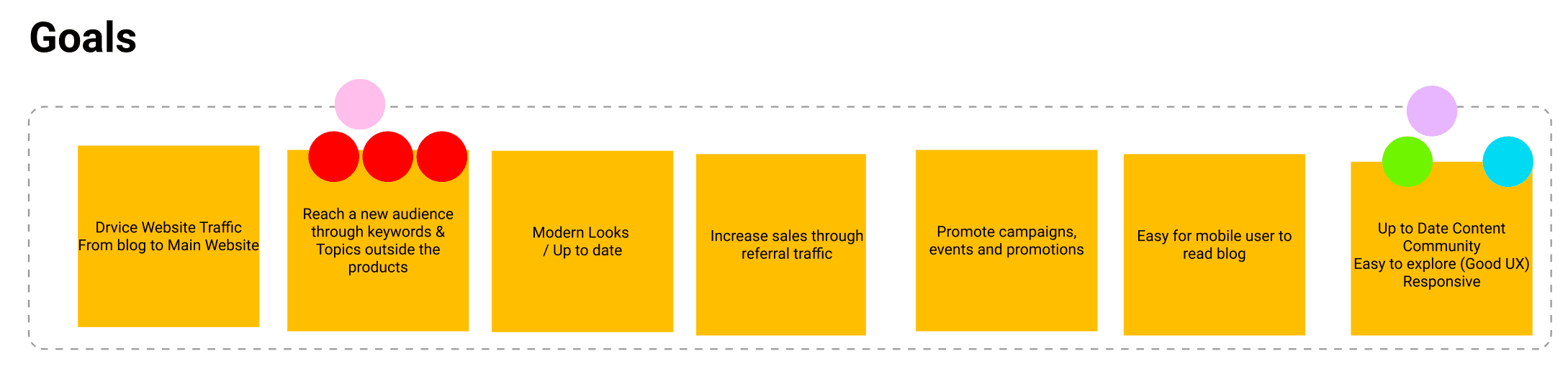
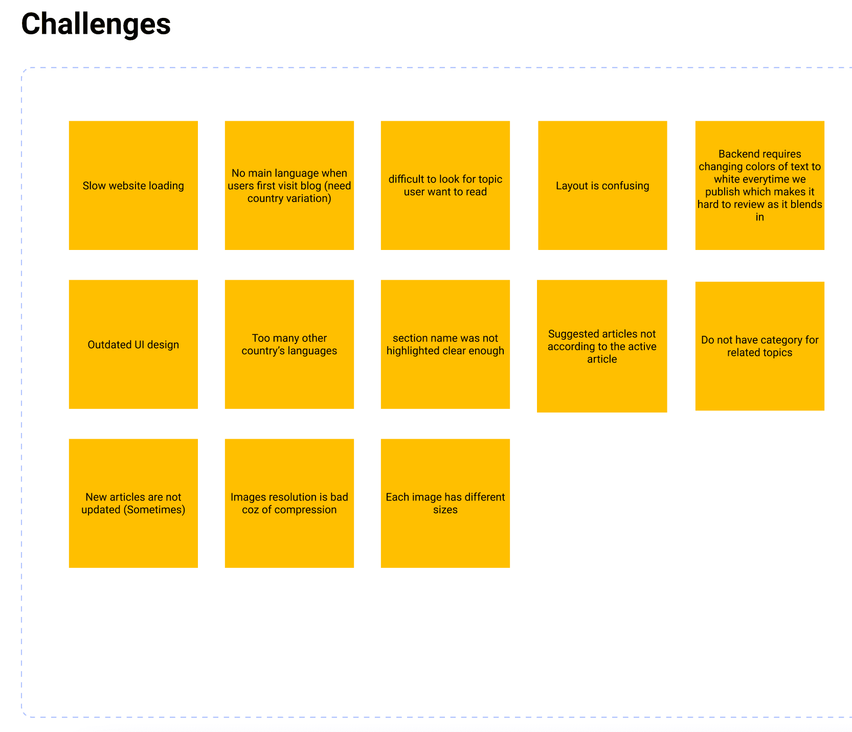
Discussed and documented the challenges facing the existing blog, ranging from technical limitations to content gaps.
Used the “How Might We” (HMW) framework to reframe problems as opportunities for innovation (e.g., “HMW make it easier for users to find relevant content?” or “HMW encourage blog readers to explore Wallet-Codes products?”).
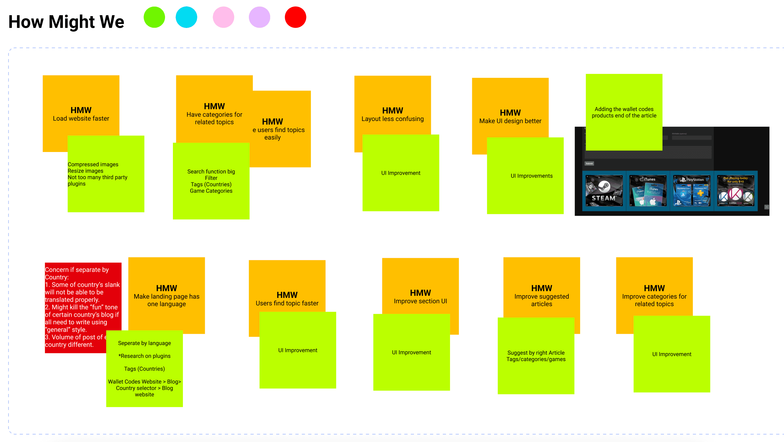
Collaboratively defined the brand attributes we wanted the new blog to embody fun culture & voice and give exclusiveness as value for the game enthusiast customers ensuring design efforts would align with the company’s overarching vision.
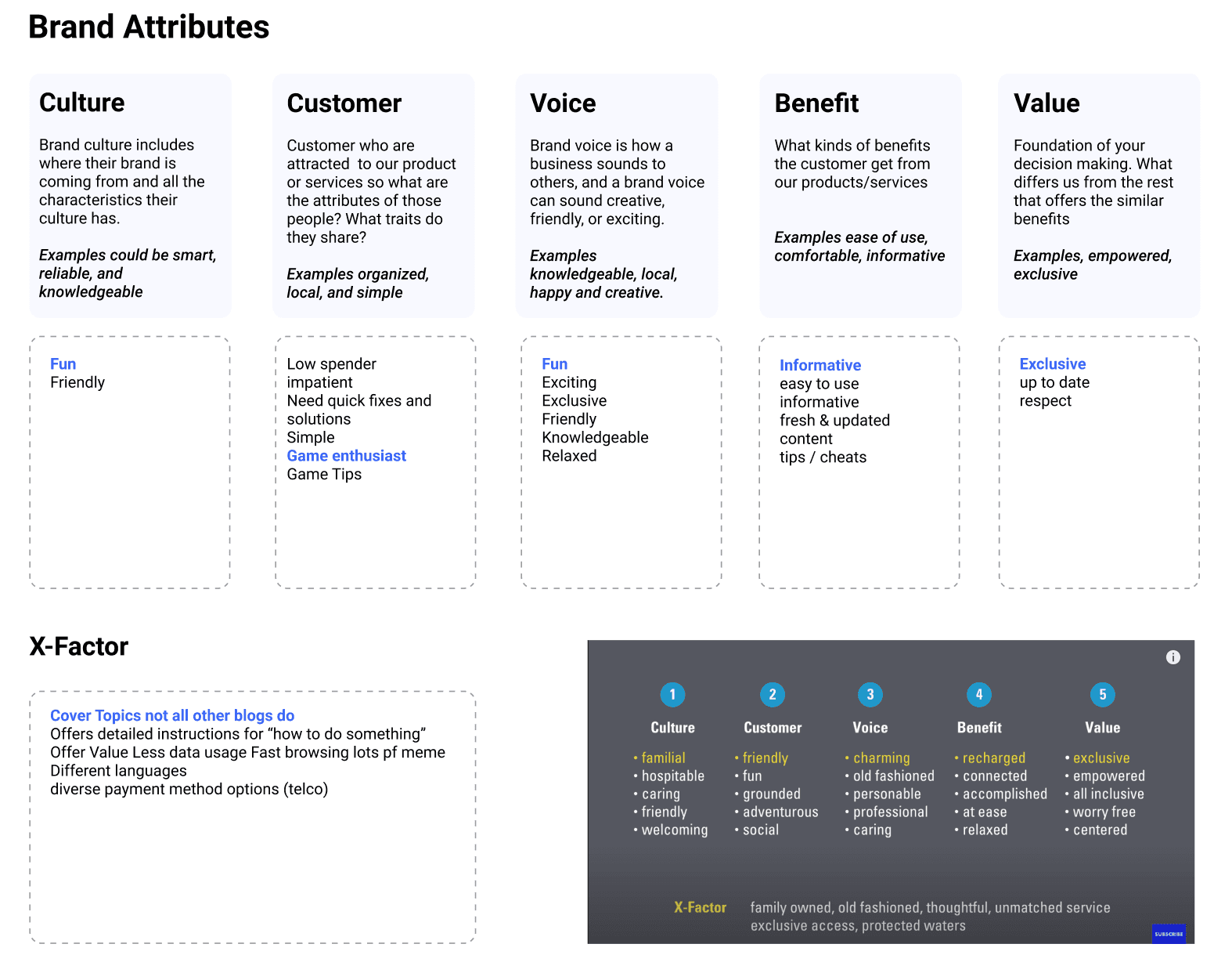
Proposed Information Architecture
One of the most impactful early deliverables was a complete overhaul of the blog’s information architecture. The original site lacked clear content hierarchy, making it hard for users and search engines to understand what the blog was about and how to navigate it.
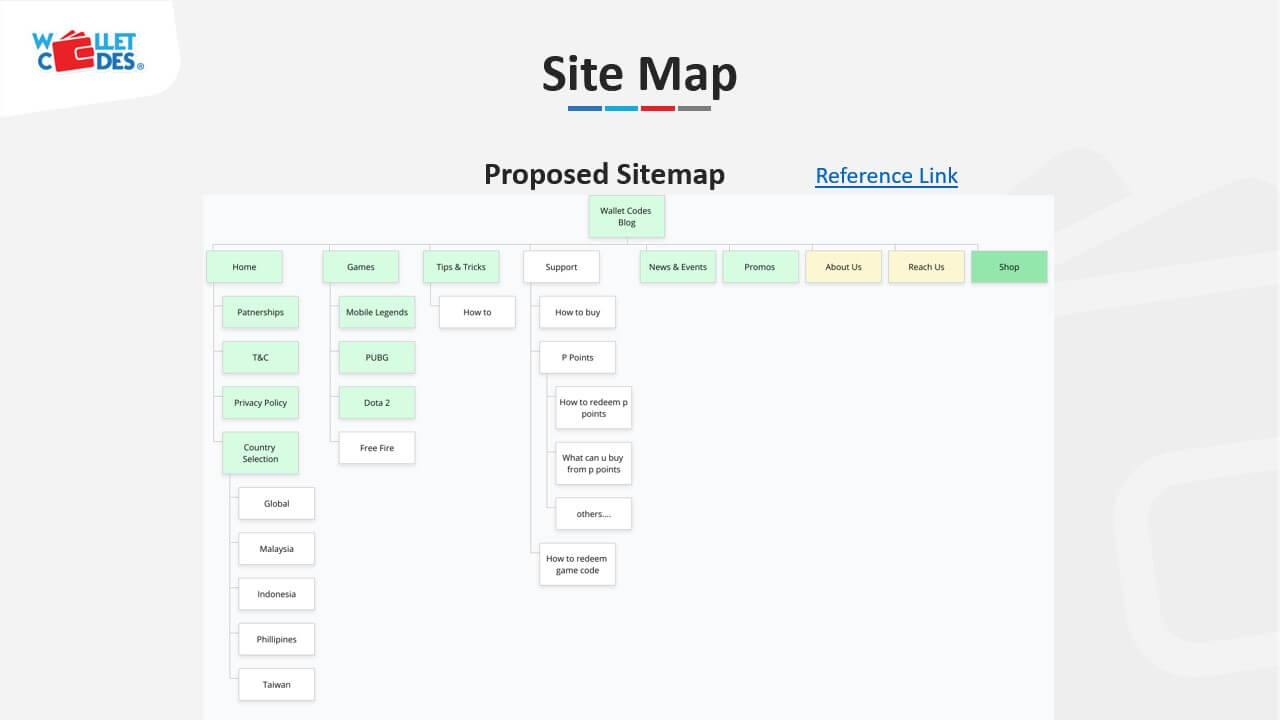
📐 Industry Trend — Information Architecture as SEO Infrastructure
Google’s 2023 Helpful Content guidelines and ongoing core updates increasingly reward sites with clear topical authority and well-organized content hierarchies. For gaming blogs, organizing content around game-specific hubs (e.g., a dedicated PUBG Mobile section) allows sites to build topical depth that ranks for competitive terms. Our new IA wasn’t just about usability — it was an SEO strategy that laid the groundwork for organic traffic growth.
Ideate & Design — Building the Engagement System
Design System Foundation
Before designing screens, I established a visual system showing Wallet-Codes’ brand DNA adapting it for a blog context that needed to feel both credible and energetic.
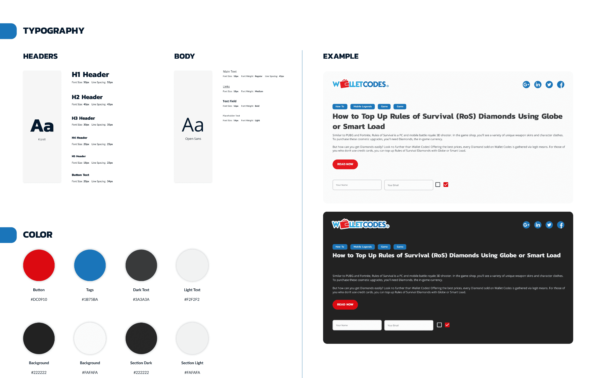
The decision to build a dark/light theme switcher rather than simply defaulting to one mode came directly from two data signals working together. First, Google Analytics session time-of-day data showed a sharp spike in blog traffic during late evening and night hours (8 PM–2 AM): the exact window when our 18–24 year-old gaming audience unwinds after school or work, browsing in low-light environments on their phones. This made dark mode a functional necessity for our peak audience.
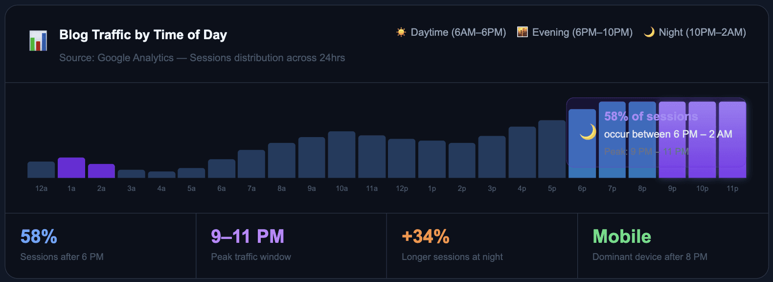
But the second signal mattered just as much: a meaningful portion of traffic also arrived during morning and afternoon hours commuters, students in class, or users on desktop in daylight. Forcing dark mode on them would hurt readability. The solution was a user-controlled toggle: respect the night-time majority with a dark default while giving daytime readers the agency to switch.
🌙 Design Decision: Dark mode defaulted because the data showed it but the switcher existed because good UX never forces a single experience on a diverse audience. The toggle was placed persistently in the navigation so it’s discoverable on first visit and always accessible zero friction to switch.
The Homepage: A Dynamic Content Hub
The redesigned homepage replaced a static, text-heavy landing with a dynamic editorial experience. The hero section led with rotating “Latest Articles” and “Popular Guides” carousels, a prominent search bar for quick information seekers, and subtle nudges toward the main Wallet-Codes product.
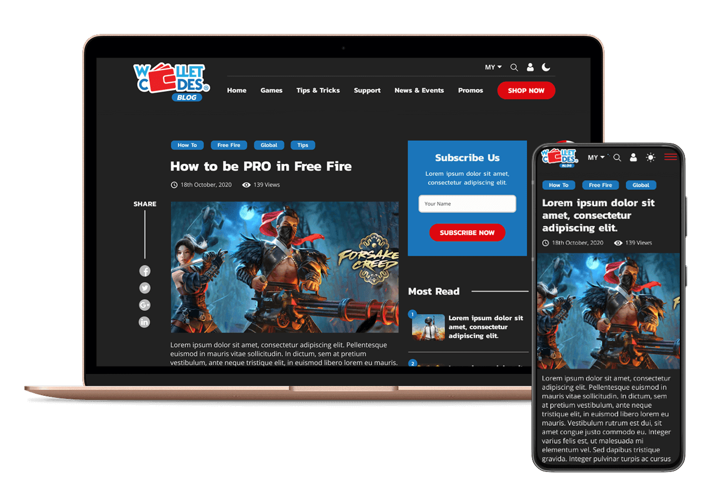
📌 Design Decision: The “SHOP NOW” CTA in the top navigation was deliberately given high visual weight and color contrast. Every user who lands on the blog sees a direct pathway to the product site immediately without requiring them to finish reading first.
Article Page: Designed for Completion
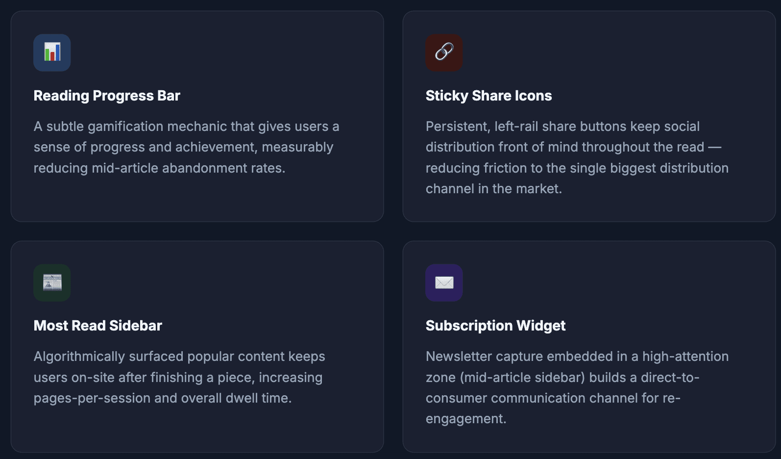
The article experience was rebuilt around a single behavioral goal: get users to finish what they started. Research shows that completed reads correlate directly with higher click-through rates on embedded CTAs.
In-Article Product CTAs: The Conversion Layer
The most strategically critical design element was the in-article product module a contextually relevant sidebar panel surfacing the exact Wallet-Codes products related to the article being read.
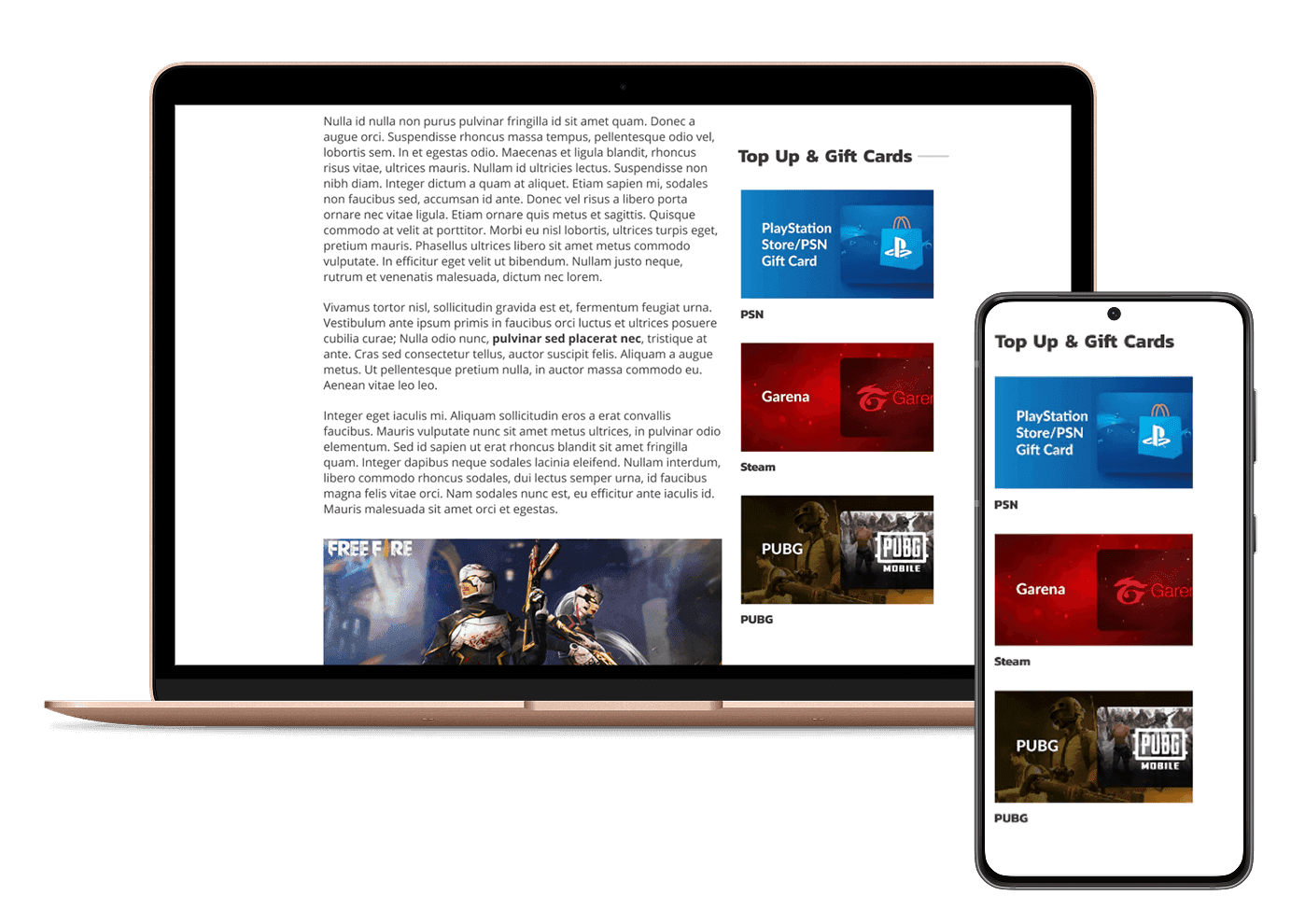
💡 The Principle: Someone reading “How to Top Up Garena Diamonds” is already primed to purchase — they just need the right offer, in the right place, at the right moment. These contextual product modules created a seamless bridge from content intent to commercial action.
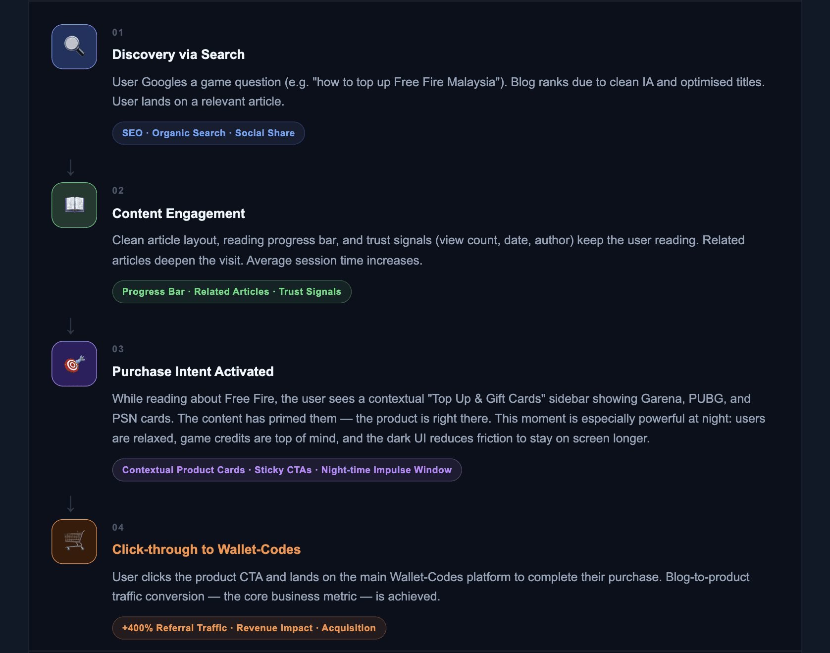
How the Blog Drives Traffic to Wallet-Codes
Every design decision was engineered to move users through this funnel — from organic discovery to purchase
The Blog That Wasn’t Pulling Its Weight
Wallet-Codes is a leading Southeast Asian platform for digital gift cards, game top-ups, and online vouchers operating in a fast-growing market where mobile gaming and digital commerce are exploding. Yet, their blog one of the most powerful potential acquisition tools in their digital ecosystem was underperforming.
Low readership, poor engagement, and a near-zero referral rate to the main product site meant the blog was a missed opportunity.
📊 Industry Context — Why Content-Led Growth Matters in Gaming
The Southeast Asian gaming market reached $5.5B in 2023 and is projected to grow at over 9% CAGR through 2028 (Statista). Mobile gaming dominates, and platforms like Codashop, UniPin, and Razer Gold are investing heavily in content marketing to capture organic search traffic and build brand loyalty. For digital goods platforms, a blog isn’t just a news feed — it’s a full-funnel acquisition engine when designed with intent.
Impact — The Numbers That Mattered

Where the Wallet-Codes Blog Goes Next
Looking at this work through a 2025 lens, the foundational IA and UX system we built creates a launchpad for the next generation of features — particularly those enabled by AI.

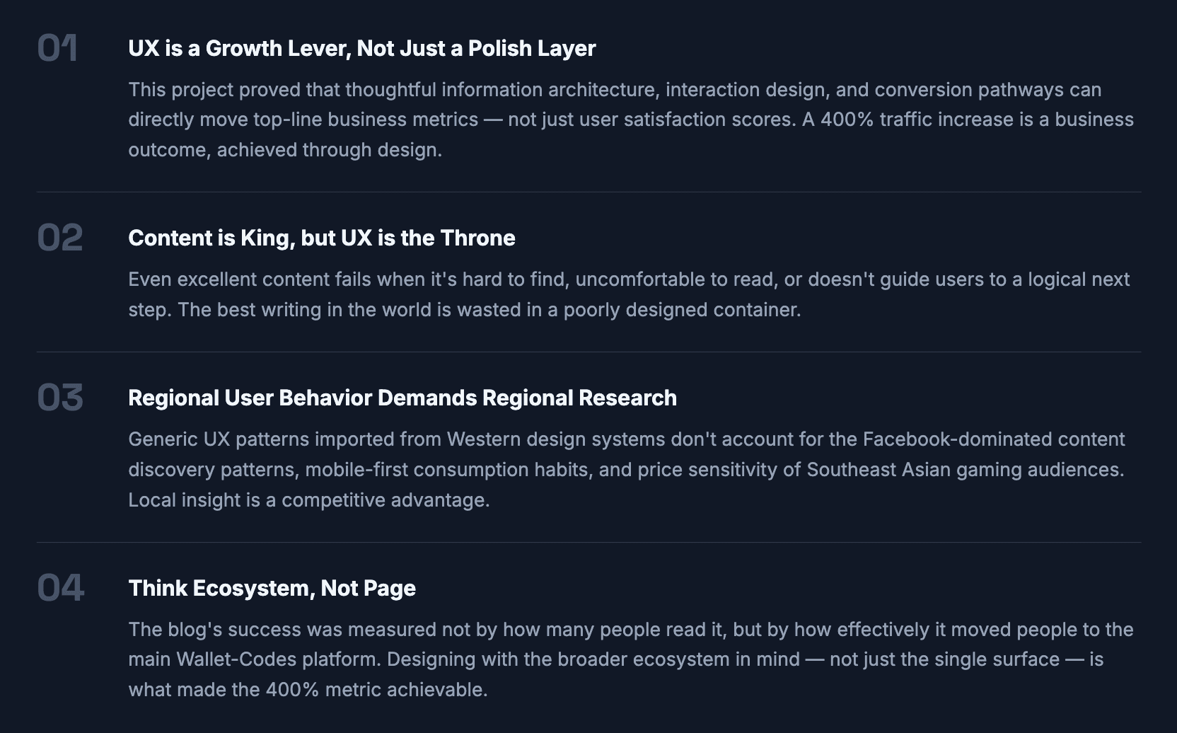
What This Project Taught Me