From 10% scroll depth to 8× engagement
Redesigning Mudah’s homepage and shipping Trending Now and Recently Viewed to drive 8× ad views and 948 direct leads.
Mudah.my
App
Role
Sole Sr. Product Designer
Timeline
3 Months
team
Multiple Product Managers and Engineering Managers
platform
Web, iOS, Android

Introduction
Every day, millions of users land on Mudah.my’s homepage. Less than 10% of them scroll past the first fold
The homepage was the platform’s single largest entry point, the first thing the majority of our users saw every session. 76% of app sessions and 42% of web sessions listed it as their starting point. And yet users were almost entirely ignoring everything we had put in front of them. They arrived, used the search bar, and left without engaging with anything else. Homepage pageviews had declined 31.79% in less than two years. Session depth was falling across every platform. A page that millions of people visited every day had quietly become our most wasted opportunity.
This case study documents how I diagnosed what was broken, established a new design foundation, designed and tested a full homepage redesign, navigated cross-functional pushback, and shipped two live features — Trending Now and Recently Viewed — that together delivered measurable improvements in engagement, session quality, and lead conversion.
Designer | Ajay | Sr. Product Designer |
Duration | 3 Months | |
Role | Sole Sr. Product Designer, collaborating with multiple Product Managers and Engineering Managers | |
Tools | Figma, FigJam, Microsoft Clarity, GA4 |
The Problem
The homepage was the platform’s biggest missed opportunity
When I first dug into the data, what struck me most was the contradiction: the homepage was Mudah’s most-visited page — 42% of web sessions and 76% of app sessions listed it as their entry point — yet it was almost entirely passive. Users arrived, used the search bar, and ignored everything else.
Homepage pageviews had declined 31.79% from January 2024 to September 2025. Average session depth had dropped 13.13% across platforms. Users were bypassing the homepage as a discovery surface and going straight to listings.
When I pulled the component-level CTR data from GA4 these were the results
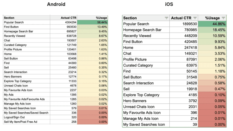
The Hero Banner, Explore Top Category, and Curated Category sections — components that together consumed most of the first fold — were practically invisible to users. Meanwhile, less than 10% of mobile users scrolled past the Explore Top Categories section, and fewer than 5% reached the Curated Content carousels below. We were filling our most valuable screen real estate with things users were actively ignoring.
Three root causes
Through my analysis, I identified three distinct but interconnected problems:
1. Poor Information Architecture & Layout
The homepage was cluttered with overlapping and repetitive components. The Hero Banners and Explore Top Categories sections duplicated each other in function. The Curated Category carousels below were manually refreshed by the category and marketing teams — a process that was neither scalable nor timely. The result was a page that felt stagnant and low-effort, particularly for returning users who saw the same content visit after visit.
2. No Personalisation or Contextual Intelligence
Every user — regardless of their history, preferences, or intent — saw the exact same homepage. A returning user who had spent the past week browsing used cars got the same generic layout as a first-time visitor. There was no way to resume a previous browsing session, no personalised content feed, and no dynamic signals to surface what was trending or newly relevant to their interests. Younger users in particular — accustomed to algorithm-driven feeds on TikTok, Instagram, and Shopee — had a baseline expectation of personalised, dynamic content that our homepage simply did not meet.
Goals
I aligned with the Product Managers on three overarching business goals for 2026 that this project needed to serve:
Drive organic user growth and discoverability
Grow the app user base
Cement Mudah’s position as Malaysia’s first-choice for second-hand goods
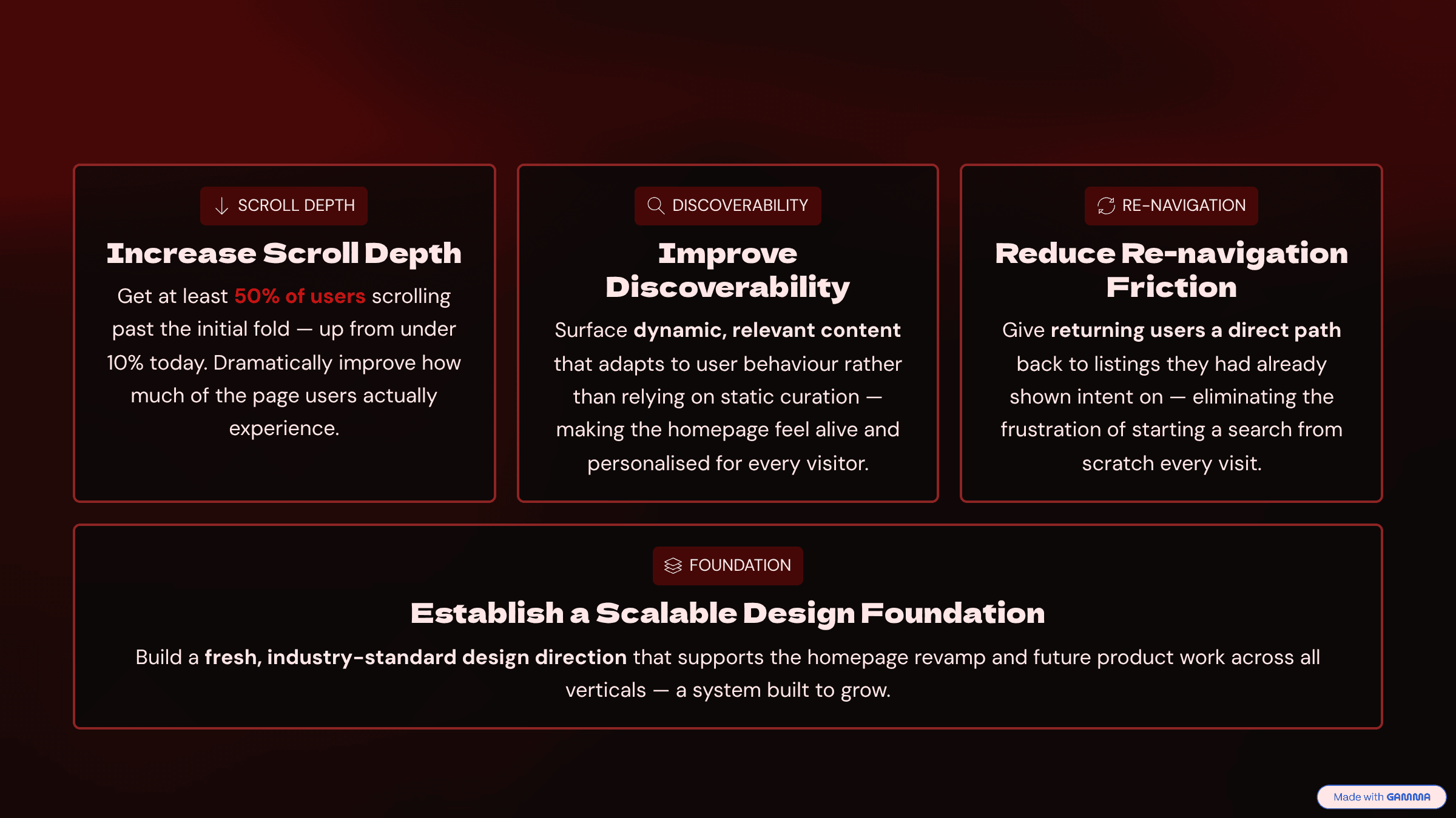
Working with the PMs, we defined four concrete design goals and agreed on how success would be measured:
My Process
Phase 1 — Discovery & Research
Before I opened Figma, I committed to grounding every design decision in evidence. My research ran in two stages: a quantitative survey to establish the problem landscape at scale, followed by qualitative usability testing to validate my design direction with real users.
Stage 1: Quantitative Survey
I ran a Homepage Buyer Experience Survey targeting Mudah.my users to understand what they expected from the homepage, what was distracting them, and how they evaluated two design directions. 95 respondents completed the survey.
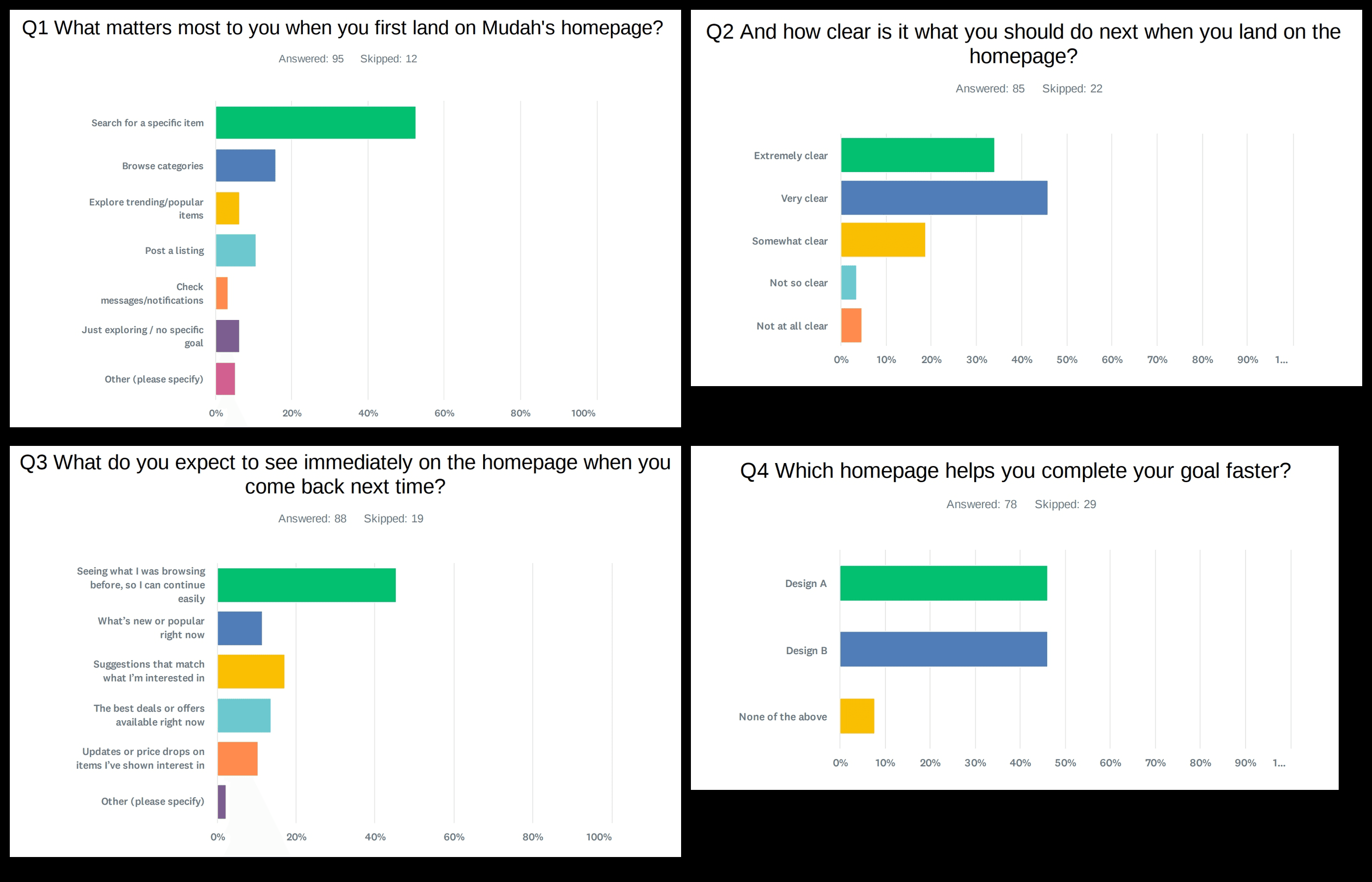
The findings shaped both my design direction and the hypotheses I brought into testing:
Users arrive with clear search intent — but nearly half want continuity when they return. 52.63% of respondents said searching for a specific item was their primary goal on landing. But when asked what they expected to see when coming back to the homepage, 45.45% said they wanted to see what they were browsing before — the single largest response. These were not passive browsers — 69.69% used the platform daily or a few times a week, and Cars and Property were the dominant categories at 61.19% and 43.28% respectively.
The homepage was reasonably clear but not serving returning users. 79.99% of respondents rated the current homepage as extremely or very clear in terms of what to do next. But clarity of navigation is not the same as delivering what users actually came for. The 45.45% who wanted to continue where they left off had no direct way to do so — they had to rely on memory or repeated searches.
Banners were the most distracting element by a significant margin. When asked what felt unnecessary or distracting, 48.57% named too many banners or promotional ads — the single largest complaint by far, with content feeling repetitive coming in second at 15.71%. This was the user-stated validation of what the GA4 CTR data was already showing behaviourally.
The search bar and popular searches dominated what users valued. In their preferred design, 30.99% said the search bar stood out most, and 23.94% cited popular searches. Better visuals ranked third at 14.08%, and clear categories fourth at 12.68%. This confirmed that visual improvement alone would not be enough — the functional hierarchy of the homepage needed to change first.\
Stage 2: Competitor & Platform Analysis
In parallel, I ran FigJam sessions with the Product Managers to align on the problem space and map out the Jobs to Be Done for both new and returning users:
User Type | Key Job to Be Done |
New Users | Find relevant listings in as few clicks as possible |
New Users | Orient themselves and discover what Mudah offers |
Returning Users | Resume their browsing journey from where they left off |
Returning Users | Discover listings beyond their primary category of interest |
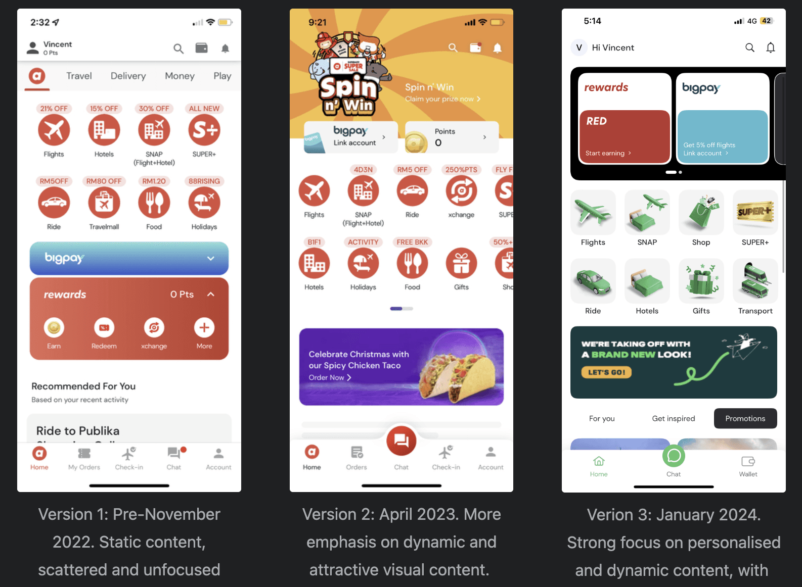
I also conducted a competitor analysis of platforms winning on homepage experience — Carousell, Shopee, Grab, and AirAsia MOVE. AirAsia MOVE was particularly instructive: they went through three homepage iterations between 2022 and 2025, moving from static scattered content to a dynamic personalised feed, with their new homepage components becoming the number one user touchpoint on the page. That trajectory gave me a concrete reference point for what was achievable.
Stage 3: Heatmap Analysis
By the time I had worked through all three research inputs, they were telling a remarkably consistent story.
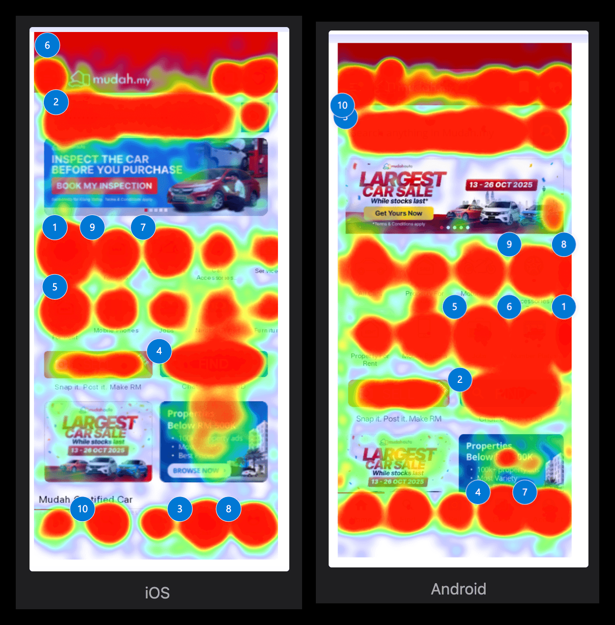
The GA4 and Clarity behavioural data showed us what was happening — millions of users arriving on the homepage every day and engaging with almost nothing beyond the search bar. Components that consumed the majority of the first fold were generating sub-0.1% CTR. Less than 10% of users were scrolling past the initial fold. The behaviour was unambiguous: the homepage was not working.
What the Research Told Me — and What I Did About It
Research only has value if it drives decisions. Here is how the survey findings translated directly into specific design choices:
“45.45% of returning users wanted to see what they were browsing before” → Recently Viewed as the first content module The single largest user expectation when returning to the homepage was continuity — users wanted to pick up where they left off. This was the primary data point that validated placing Recently Viewed as the first content module users encounter after the search bar. It was not an aesthetic choice or a product assumption — it was the direct response to what the majority of returning users told us they needed.
“48.57% said too many banners or promotional ads were the most distracting element” → Reframing the banner space When I pushed back against the Marketing team on the traditional top-of-page promotional banners, I had two data points behind me: the 0.05% CTR from GA4 telling me users were ignoring the banners behaviourally, and this survey finding telling me users were actively finding them distracting. Nearly half of all respondents named banners as the single most unnecessary element on the homepage. That combination of behavioural data and stated user preference made the case for reframing the banner space from an ad surface to an information surface impossible to argue against.
“52.63% arrive with search intent, 30.99% said the search bar stood out most” → Search bar as the dominant top-of-page element With over half of users arriving at the homepage already knowing what they want to search for, and nearly a third citing the search bar as the most prominent element in their preferred design, keeping the search bar as the dominant top-of-page element was non-negotiable. I reinforced this further by adding rotating placeholder text based on the user’s recent searches — turning a passive input field into an active continuation of the user’s browsing journey.
The unified conclusion
❤️
Personalisation was not a feature enhancement — it was the baseline expectation.
Every user who lands on Mudah’s homepage has different needs, different intent, and different browsing history. A homepage that shows everyone the same thing is not just a missed opportunity — it signals to users that the platform is not paying attention to them. Updating the homepage was not just a design improvement. It was a visible quality signal — evidence that Mudah was actively investing in the experience rather than standing still while competitors moved forward.
Synthesis & Design Framing
Before moving into Figma, I needed to bridge the gap between what the research was telling me and what the design needed to solve. I ran How Might We (HMW) exercises with the PM to reframe our research findings as design opportunities — turning data points into actionable design questions that could be explored across multiple directions. This was accompanied by basic sketching to rapidly explore layout concepts at low fidelity before committing any direction to high-fidelity screens.
To ensure every design decision was grounded in established UX principles rather than aesthetic preference, I defined a set of principles that would govern the homepage architecture across all three versions:
Thumb-Zone Optimisation — Fitts’s Law
On large phones, reaching the top of the screen comfortably is a genuine usability challenge. I placed all important actions — Search, Sell, Messages, Navigation — within natural thumb-reach zones. The bottom navigation was designed specifically around this principle, ensuring the most frequent actions required the least physical effort.
Hick’s Law — Reducing Choice Overload
The existing homepage overwhelmed users with too many entry points competing for attention simultaneously. I reduced decision load by combining Property Sale and Rent into a single Property category, condensing the category chips, and removing the hamburger menu entirely — distributing its contents into their respective pages where they belonged contextually.
Progressive Disclosure — Hiding Complexity Until Needed
Rather than surfacing everything at once, I revealed complexity progressively. Only one row of categories is visible on load — the rest are hidden until the user actively chooses to explore. Favourites were moved under Account rather than sitting as a top-level navigation item. The hamburger menu was removed and its elements redistributed to their natural contextual homes.
Goal-Gradient Effect
High-intent actions — Search, Sell, Messages — were placed in visible, predictable, and consistent positions. Users arriving with a specific goal should never have to hunt for the action they came to perform.
Serial Position Effect
People remember what they see first and last most strongly. I applied this deliberately at the homepage level: Recently Viewed was placed as the first content module users encounter after the search bar — so the very first thing a returning user sees is a direct path back to where they left off. Trending Now, feeding into infinite scroll, anchors the bottom of the experience — ensuring there is always fresh, engaging content at the end of the scroll journey.
Design System Foundation
The state we were starting from:
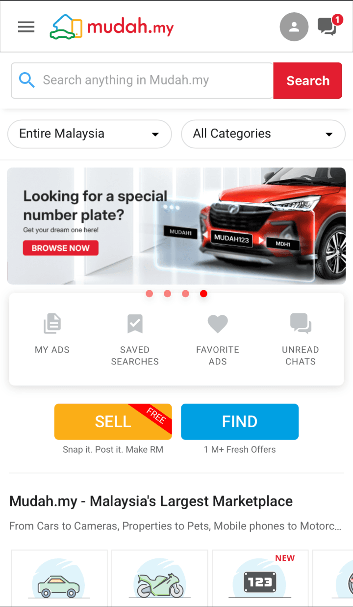
Android used stock Material Design 2 components — generic, off-the-shelf, not Mudah
iOS used basic Apple iOS components — a completely separate visual language from Android
Typography was fragmented across platforms — Roboto on Android, SF Sans on iOS — neither aligned with Mudah’s own brand guideline font, Open Sans
Components were so visually outdated that PMs were actively refusing to use them and pointing to competitor products as the standard we should be meeting
No shared design language across platforms
No cross-platform consistency — the product looked and felt different depending on which device you were on
No single source of truth that designers or engineers could confidently build from
The new direction:
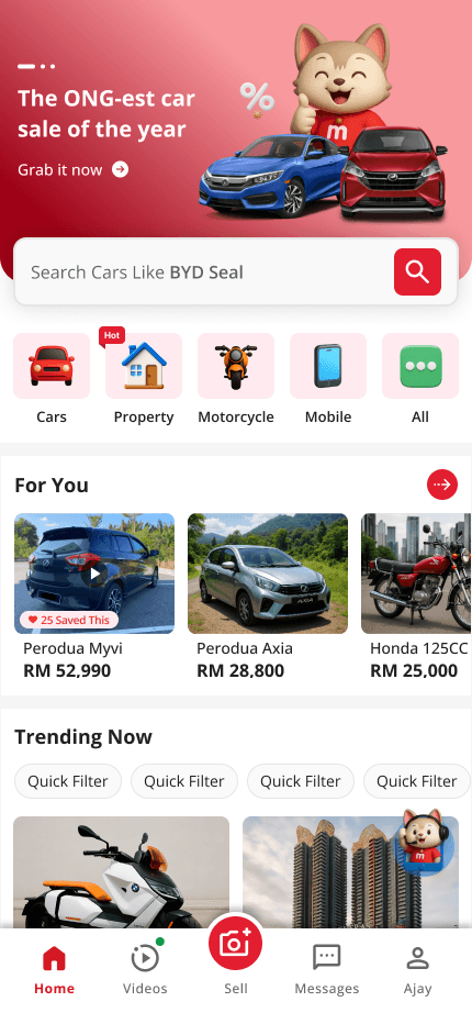
I used the homepage revamp as the mandate to establish a new, unified design direction. The core principle was simple: one font, one component set, across Android, iOS, and Web. A unified component set across all platforms dramatically reduces the maintenance burden and makes it significantly easier for other vertical teams to adopt and build consistently without making independent design decisions.
The new visual language introduced alongside this unification included:
3D icons replacing flat icon sets for a more modern, premium feel
Gradient usage across key UI surfaces to add depth and visual energy
3D version of Mudah’s mascot Miu integrated contextually into onboarding and guidance moments
More curved border radius on components — moving to a softer, more contemporary aesthetic
Modern iconography aligned with current design trends across leading consumer apps
Subtle micro-animations on interactions — purposeful motion that gives feedback and adds polish without overwhelming the experience
Design Exploration
With a grounded problem definition, a clear design direction established, and UX principles defined, I moved into homepage design. I worked in Figma to develop three distinct concepts — Version A, B, and C — each testing a meaningfully different hypothesis about how to solve the problem:
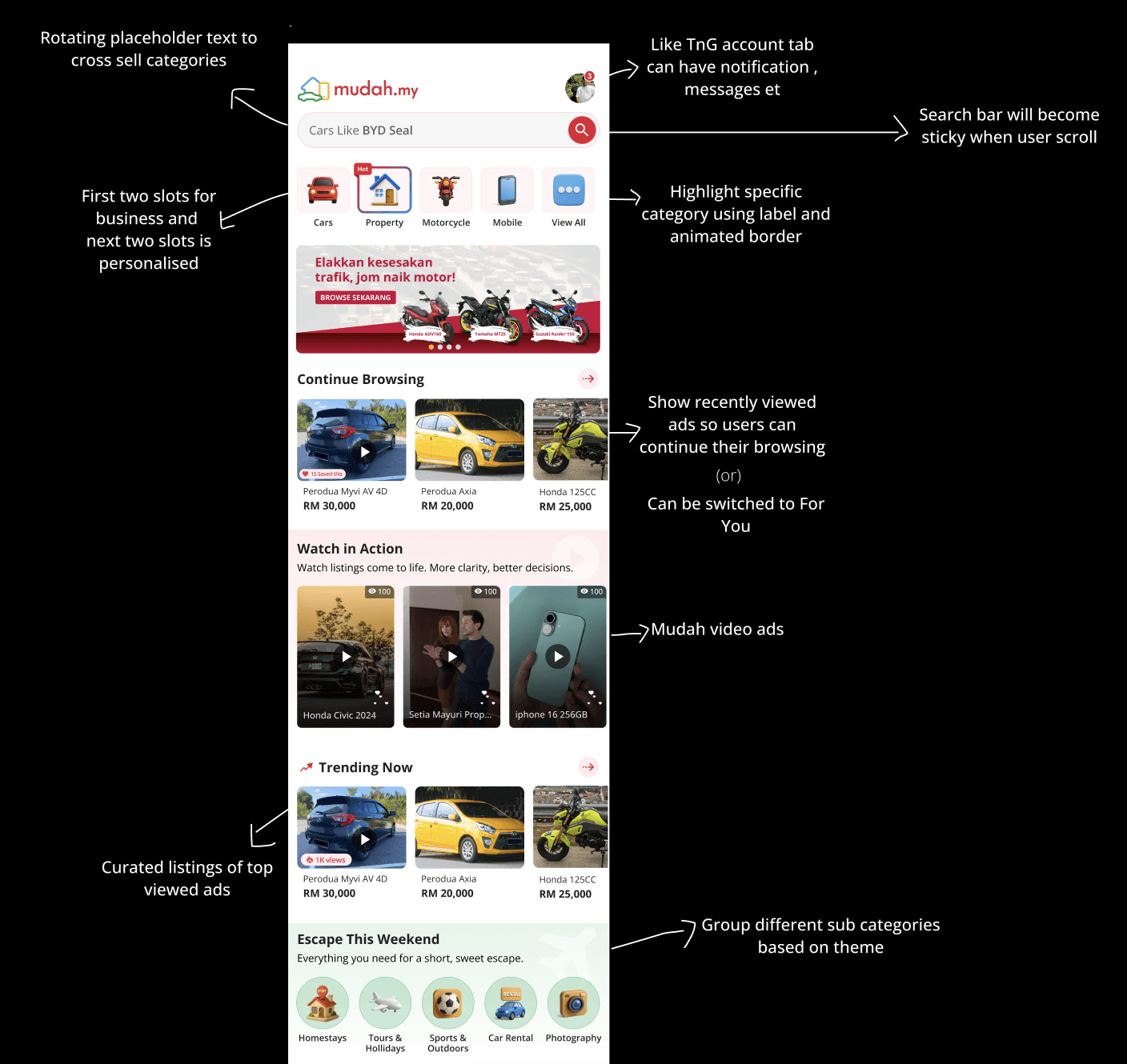
Version A — Fully Personalised
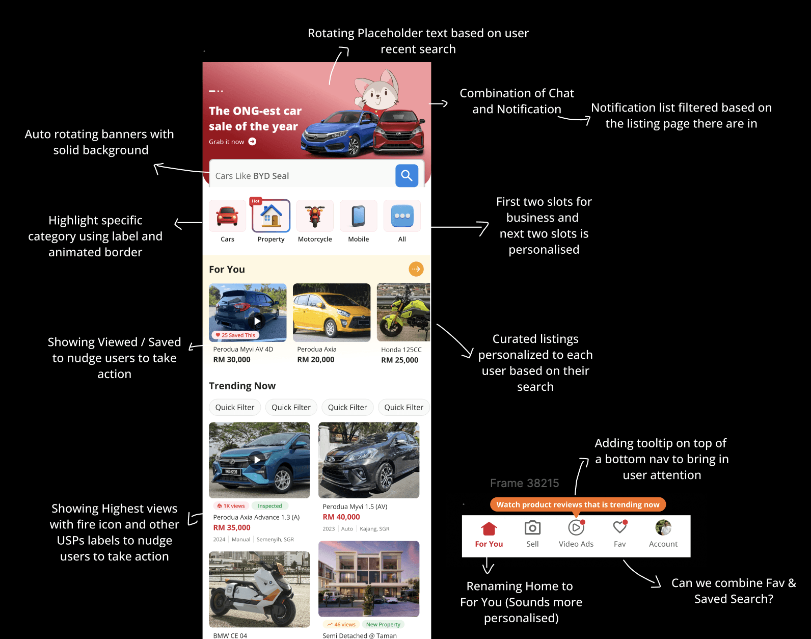
Layout — top to bottom:
Auto-rotating Hero Banner with solid background — reframed from an ad surface to an information surface
Search bar with rotating placeholder text based on the user’s recent searches — turning a passive input into an active continuation of their browsing journey
Combined Chat and Notification icon — notifications filtered contextually based on the listing page the user is currently in
Category chips (Cars, Property, Motorcycle, Mobile, All) — first two slots reserved for business priorities, next two personalised to the individual user, highlighted with an animated border
Recently Viewed — the first content module users see, surfacing previously viewed listings to enable immediate session continuity
For You — curated listings personalised to each user based on their browsing behaviour, with Viewed/Saved nudges to encourage action
Trending Now — highest-viewed listings surfaced with fire icons and USP labels, with Quick Filter chips for category-level exploration
Promo banners — sized consistently as ad and video ad carousels, integrated naturally into the feed rather than dominating the top of the page
Infinite scroll feed — no hard stopping point, keeping users in discovery mode
Sticky behaviour: When users scroll past Popular Search, it becomes sticky at the top and acts as tabs. The category chips and content below update dynamically based on the selected tab — keeping the experience contextually relevant no matter how deep the user scrolls.
Bottom navigation: Renamed from “Home” to “For You” — a deliberate signal that the entire experience is built around the individual user, not a generic homepage. A contextual tooltip was added to draw user attention to the change on first visit.
Version B — Simple & Easy
Version B tested a specific visual and brand hypothesis: if we stripped back the dominant use of red and let the Mudah logo carry more of the brand identity, would the homepage still feel distinctly Mudah to users — or would reducing the brand colour weaken that connection?
Visual approach:
White as the dominant base colour — pulling back on red as a pervasive UI colour throughout the page
Red used selectively — reserved only for the most important UI elements where it needed to signal priority or action
Mudah logo as the primary brand anchor — carrying brand recognition rather than relying on colour saturation
Layout & structure:
Simpler and more familiar in organisation — closer in feel to the current production design
Cleaner execution with less visual density and fewer competing elements
Reduced cognitive load through restraint rather than through personalisation
The core hypothesis: Could simplicity and visual restraint deliver the same sense of brand recognition and user confidence that Version A achieved through a bolder, more immersive personalised experience — or does Mudah need its signature red and dynamic content to feel like itself?
Version C — Hybrid
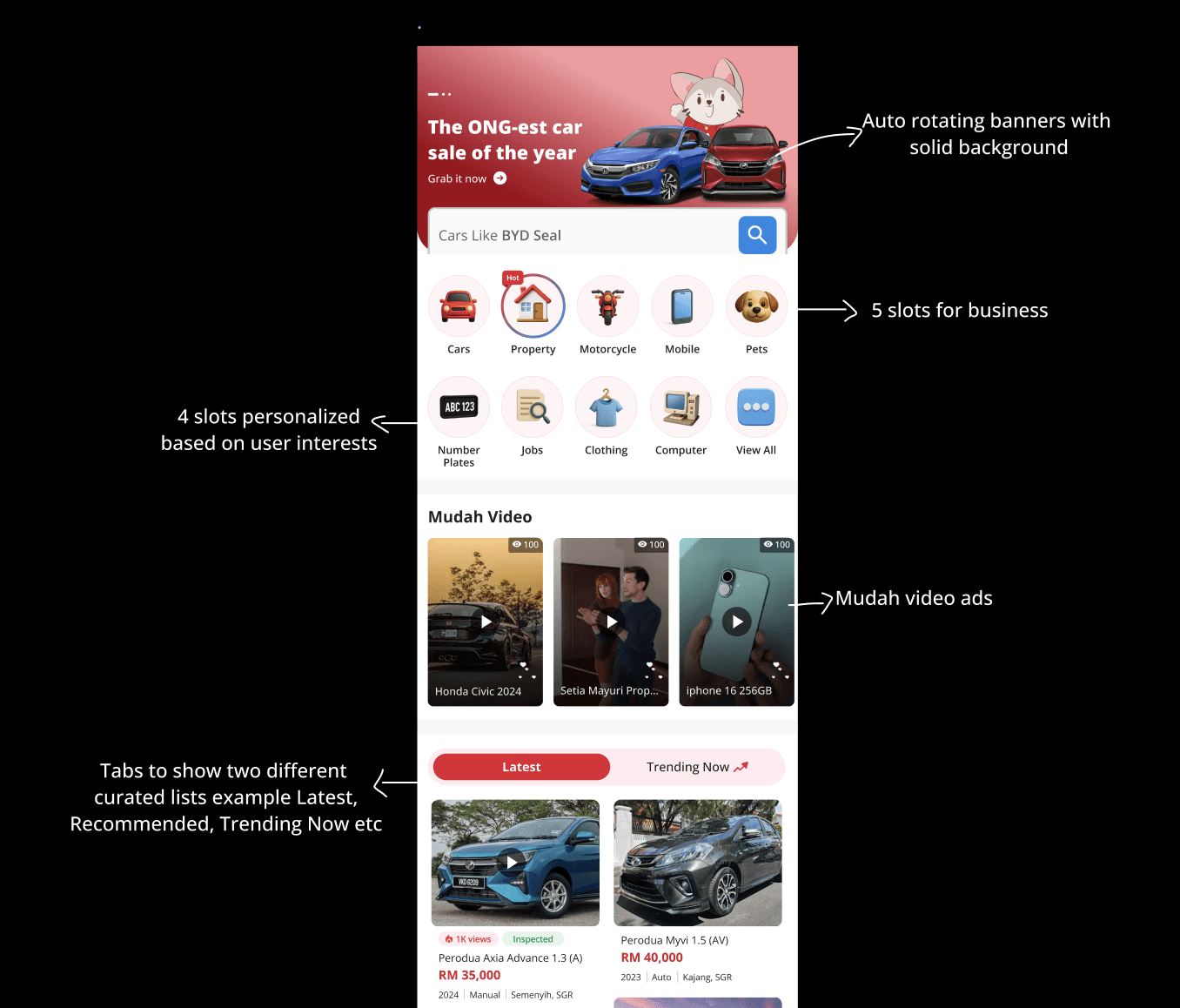
Version C tested a more conservative personalisation hypothesis: rather than fully replacing what users already knew, what if personalisation was layered gradually on top of the familiar homepage structure?
Content approach:
Retained manually curated sections alongside dynamic personalised modules — the closest of the three versions to the existing homepage experience
Personalised modules included — Recently Viewed and For You sit within the layout, but static curated sections remain alongside them
Familiar structure preserved — users encounter recognisable patterns from the current homepage without being asked to adapt to an entirely new experience
Layout philosophy:
A middle ground between the bold personalisation of Version A and the visual simplicity of Version B
Evolution over revolution — personalisation introduced incrementally rather than as a full departure from existing patterns
Designed to reduce the risk of alienating users who were already comfortable with the current homepage
The core hypothesis: Would users respond better to a gradual, familiar evolution — where personalisation is present but not dominant — rather than a complete reimagining of how the homepage works? Or would the retention of static curated sections hold the experience back from delivering the full personalisation benefit?
👉🏻
Why these three versions mattered as a set
Together the three versions were testing three meaningfully different hypotheses: Version A asked whether full personalisation delivered the best experience, Version B asked whether visual simplicity and brand restraint resonated more strongly, and Version C asked whether a hybrid of old and new was the safer and more familiar path.
Accessibility & People-Centred Design
Designing for Mudah’s future users
Primary target audience — Millennials, Gen Z, and Gen Alpha — the generations who will dominate car and property purchases, Mudah’s most important and highest-value categories
Gen X acknowledged — still a current user segment but a declining audience for these high-value categories as younger generations take over as primary buyers
Every visual and interaction decision was made with younger, mobile-native users in mind:
3D icons
Gradient usage
Modern iconography
More curved components
Subtle micro-animations on interactions
Design decisions across age groups
Font sizes — considered for readability across age groups, ensuring text remains legible for older users within the target range
Touch targets — sized to accommodate different age groups, supporting both younger mobile-native users with precise tap behaviour and older users who benefit from larger, more forgiving interactive areas
Connected directly to Thumb-Zone Optimisation — comfortable reach and comfortable tap size treated as two sides of the same accessibility consideration
Colour contrast
All colour combinations checked against WCAG AA minimum contrast standards
This included text on gradient backgrounds and the brand red #E21E30 used for CTAs and active states
No aesthetic decision was allowed to compromise legibility
Internal Design Critique Session
Throughout the exploration phase, I held ongoing review conversations with different PICs depending on the topic at hand — the PM was my primary collaborator throughout, with engineering, category managers and other Product Designers
Combining Chat and Notifications into one icon
Before — Chat and Notifications were two separate elements competing for space in the top navigation bar
The decision — through discussion with the PM, we agreed to combine them into a single unified icon
How it works — notifications are filtered contextually based on the listing page the user is currently in, so the content is always relevant to where they are in the app
Why it works — reduced cognitive load, decluttered the top bar, and gave users one consistent place to manage all communications and alerts
Principle applied — directly supported the Hick’s Law principle established in the synthesis phase — fewer elements competing for attention, clearer next action
Two slots for personalisation in category chips
The tension — the category chip row had two competing needs: business priorities and user personalisation, both demanding space in the same row
The decision — reserve the first two slots for business-defined categories to ensure strategic visibility
The personalisation — give the next two slots to categories personalised to each individual user based on their browsing behaviour
The constraint was deliberate — users get a personalised experience without the platform losing its ability to direct attention to strategically important categories
The balance achieved — neither pure business nor pure personalisation wins entirely, which is exactly the right outcome for a marketplace that serves both users and commercial partners
Moving Favourites under Account
The problem — Favourites as a standalone top-level navigation item was adding unnecessary weight to the navigation bar, competing for attention with higher-frequency actions
The decision — move Favourites under Account, removing it from the primary navigation entirely
Principle applied — Progressive Disclosure — complexity hidden until the user needs it, rather than surfaced permanently at the top level
Still accessible — users who actively use Favourites can still find it easily under Account — the feature is not removed, just repositioned contextually
The outcome — the bottom navigation stays clean and focused on the actions users reach for most frequently, without penalising power users who rely on Favourites
Qualitative Usability Testing
With high-fidelity prototypes in hand, I designed and led a qualitative usability testing programme to validate the direction with real users before any engineering commitment was made.
Approach:
I used a mixed-methods approach combining online screen-sharing sessions and in-person (physical) sessions, giving me breadth across different usage contexts and device environments. Each session combined two structured elements:
Task-based usability testing — participants were given realistic scenarios and asked to complete 8 defined tasks on the high-fidelity Figma prototype
Sentiment questions — after key task moments, I asked participants structured sentiment questions on a 5-point Likert scale to capture their emotional response alongside their behavioural performance
I observed every session directly, noting hesitation points, re-taps, moments of delight, and task completion patterns. The combination of task data and live observation gave me two layers of insight: what users could do, and how they felt while doing it.
Participants:
I led sessions with 36 external participants spanning new users, casual browsers, and returning power users, recruited through face-to-face channels and social media. The PMs supported session logistics and note-taking.
Usability Performance Observations
Testing format — sessions conducted as screen-sharing calls online and in-person walkthroughs, without dedicated testing software such as Maze
Formal metric tracking — not possible given the session format, but direct observation across all 36 sessions gave a clear and consistent picture
What the observations showed:
Task completion rate — high across all 8 tasks, with the majority of participants completing every task successfully
Time on task — quick throughout, with participants moving through tasks with minimal hesitation or backtracking
Error rate — very low, with the majority of participants completing tasks correctly on their first attempt
Consistency — observations were consistent across both online and in-person sessions, confirming the results were not an artefact of the testing format
What I observed in the room:
Participants completed tasks quickly and without guidance — finding Favourites, locating the Sell button, resuming a chat — all done fluently and without prompting
Why it worked — the design followed industry-standard placement conventions already familiar to users from apps like Shopee, Grab, and Carousell, making the learning curve effectively zero
This was intentional — rather than inventing new navigation patterns, I leaned into established conventions so users could focus entirely on the content rather than figuring out the interface
✅
Version A was selected based on both quantitative scores and qualitative feedback:
From a user perspective, the fully personalised experience resonated most — users responded to seeing content that felt tailored to them rather than generic. Visually and emotionally, Version A also felt most distinctly “Mudah” to participants
Sentiment Measure | Result |
“I like this homepage design” | 87.1% positive |
“This homepage is easy to use” | 93.5% positive |
“I can easily access my account” | 100% positive |
“I can find interesting and relevant listings” | 80.7% positive |
“I will scroll down to find more ads” | 83.9% positive |
Final Design Prototype
Incremental Feature Delivery
The constraint we were working with:
The full homepage redesign — new information architecture, personalised feed system, and complete design direction implementation across platforms — would take 6 to 12 months to deliver end-to-end
This was confirmed directly by the Engineering Manager, based on engineering capacity and the complexity of required backend changes
Why waiting was not an option:
Real user problems needed solving now — not in 6 to 12 months
Business goals needed momentum in 2025
Hypotheses needed validating with real users in production — not in a staging environment
How we restructured the delivery plan:
I worked with the PMs and Engineering Manager to identify which features could be extracted, independently scoped, and shipped in the near term
The criteria was clear — features had to be self-contained enough to deliver standalone value and generate measurable data that would inform the larger redesign before it committed to engineering
Two features met that criteria: Trending Now and Recently Viewed
Why these two features:
Both addressed the core homepage problem of static, non-personalised content
Both could be built without requiring the full architectural change
Both had clear success metrics that could be instrumented from day one
What the incremental approach achieved:
Speed | Real features in front of real users within weeks — not months |
Learning | Live conversion data — including the Desktop underperformance in Recently Viewed — incorporated into the full homepage design before engineering picked it up |
Confidence | Measurable progress demonstrated throughout the 3-month window — stakeholders could see results rather than being asked to trust a long runway with no visible output |
Feature 1: Trending Now
The problem I was solving:
Curated content sections on the homepage were generating sub-0.1% CTR — users had no reason to engage with them
Content required manual updates from the category and marketing teams — not scalable or timely
Sellers had no equitable way to gain visibility from homepage placement — the system favoured whoever the team chose to feature manually
What I designed:
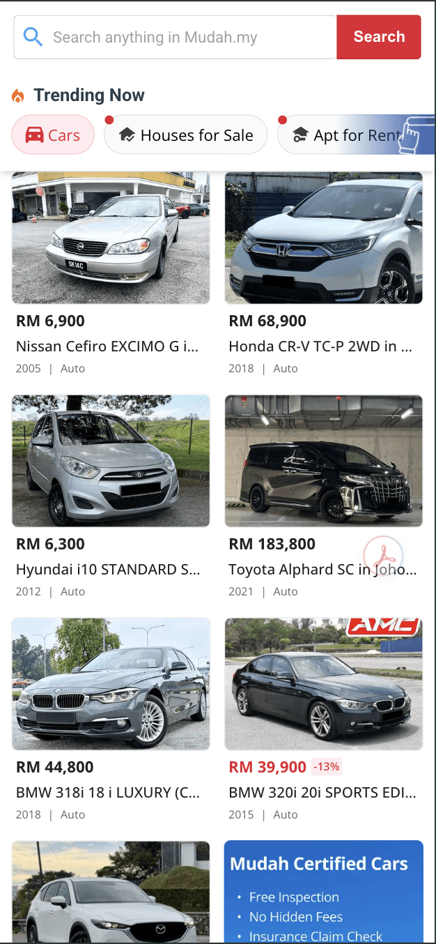
A dynamic homepage section that automatically surfaces listings gaining momentum — ranked by a combination of ad views, leads, and recency within the past 7 days, refreshing daily
Scrollable category chips across Cars, Houses for Sale, Rental Units, Motorcycles, Mobile Phones, and Pets
Each chip except the auto-selected Cars category showed a red dot indicator on first view to signal new content — disappearing once tapped
Infinite scrolling on both Desktop and Mobile Web — mirroring the scroll-native consumption patterns users bring from social and e-commerce apps
Launched: November 13, 2025 — Desktop and Mobile Web
Results vs. old curated sections (first 15 days):
Metric | Before | After | Change |
Daily Ad Views | 366 | 3,152 | +761% (8×) |
Daily Clicks | 595 | 2,775 | +366% (3.7×) |
Daily Unique Users | 515 | 2,548 | +395% (4×) |
Daily Browsers | 231 | 2,349 | +917% (9×) |
Daily Leads | 10 | 44 | +340% (4.4×) |
Daily Responders | 5 | 30 | +500% (6×) |
CTR | — | 27% | Target was 20% ✅ |
Second measurement window (December–January):
CTR climbed from 28% to 33%
Mobile Web listing clicks spiked 63% since mid-December
Trending Now users stayed 25–50% longer per session than baseline users
Bounce rate declined 8% on Mobile Web and 4% on Desktop
Category performance highlights:
Cars — standout performer, ad views up 16.4×, browsers up 20× vs old curated section
Property — strong gains, browsers up 3.57×, responders up 3.25×
Post-launch learning:
The PM identified from post-launch data that 76% of all engagement was concentrated within the top 100 listings, dropping sharply beyond that
The team recommended reducing the listing cap from 1,000 to 200 to better balance feature performance with content quality
My specific design contributions to these outcomes:
Infinite scroll pattern — no natural stopping point kept users in the content longer, directly contributing to the 25–50% longer session duration and 9× browser growth
Card design with fire icons and USP labels — surfaced high-engagement signals visually, turning passive browsing into active decision-making and giving users the confidence signals needed to click through
Placement and visibility — positioned Trending Now directly below the For You section, within natural scroll depth for a user already engaged, ensuring the feature had a real audience rather than sitting below where users rarely reached
Feature 2: Recently Viewed
The problem I was solving:
38% of browsers revisited the same listing at least once within 15 days of first viewing it
Users who favourited a listing and revisited within 15 days converted at roughly 18% — around 2× the baseline rate
Yet the platform offered no direct way to return to previously viewed listings
Users had to rely on friction-heavy workarounds:
Memory
Repeated searches
Favouriting listings manually
What I designed:
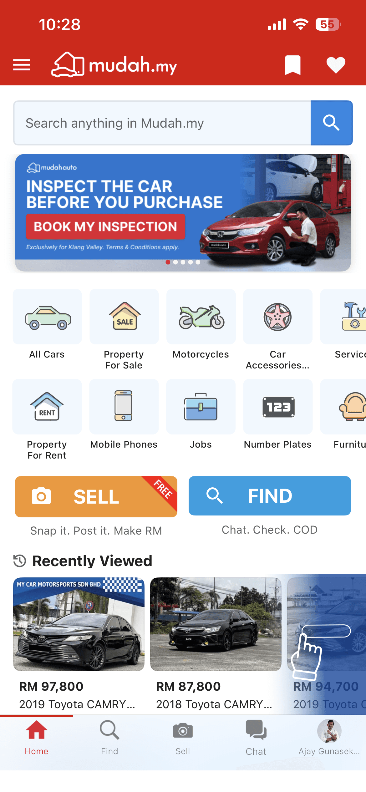
A personalised homepage module displaying up to 20 previously viewed listings in reverse chronological order (newest first), shown in a card carousel
Each card shows a thumbnail, truncated title, and price — deliberately minimal to respect the returning user’s existing context
The module only appears once a user has 5 or more viewed listings — preventing it from feeling sparse on first encounter
Key design decisions:
Cross-device sync — the PM and I made this decision together based on data showing users actively switching between desktop and mobile within the same browsing journey. Users continue exactly where they left off regardless of which device they pick up
Guest user local storage — syncs automatically on login, creating an organic incentive for account creation
Animated hand gesture on mobile — added on first interaction to encourage swipe navigation, helping users discover the horizontal scroll pattern without explicit instruction
Launched: iOS — December 1, 2025 | Android — December 8, 2025
Results:
Platform | Adoption (CTR) | Adview-to-Lead Conv. | vs. Baseline | Direct Leads |
Android | 13.5% | 2.7% | +94% | 482 |
iOS | 17.7% | 3.81% | +91% | 466 |
Mobile Web | 1.3% | 5.84% | +54% | 38 |
Desktop | 4.0% | 3.85% | -49% | 28 |
Overall impact:
948 direct leads generated from 296.5k browsers
1.3–1.9% incremental uplift to overall platform lead volume
Mobile platforms drove 98% of all leads
My specific design contributions to these outcomes:
Surfacing it as the first content module — placing Recently Viewed as the first thing a returning user sees directly answered the 45.45% of survey respondents who said they wanted to continue where they left off. A feature that answers the user’s primary need before they have to scroll will always outperform one that requires them to find it
Animated hand gesture for swipe discovery — reduced friction between a user seeing their recently viewed listings and navigating through them. Features users cannot figure out how to interact with do not convert
Card design showing thumbnail, title, and price — deliberately minimal to respect the returning user’s existing context. They remember the listing — they need just enough information to confirm they have found the right one and tap through confidently
Impact Summary
Across the 3-month project, I established a new design direction and foundation, designed and user-tested a full homepage redesign, navigated cross-functional pushback, influenced the design team, and shipped two live features that collectively delivered:
Trending Now: Ad views up 8×, leads up 4.4×, CTR at 27% against a 20% target, bounce rate down on both platforms, users staying 25–50% longer per session
Recently Viewed: 948 direct leads generated, 91–94% adview-to-lead conversion uplift on mobile apps, 1.3–1.9% incremental contribution to platform lead volume
User testing: 87.1% design satisfaction, 93.5% ease-of-use rating across 36 participants across online and in-person sessions, Version A selected
Design direction: Fresh unified visual language established — Open Sans across all platforms, new component direction, WCAG AA contrast compliance — laying the groundwork for design standardisation across vertical teams
Version A homepage fully designed, tested, and handed off for phased engineering delivery
Key Design Decisions & Rationale
Why establish a new design direction before designing screens? Building on an outdated system would have meant shipping new screens with old inconsistencies baked in. Establishing a clean, unified direction first — one font, one component set, modern visual language — meant every screen I delivered was built to a consistent standard and reusable as a reference point for future product work across verticals.
Why dynamic over static content? The sub-0.1% CTR data combined with 48.57% of survey respondents naming banners as the most distracting element made the case unambiguously. Static, manually curated sections were occupying prime real estate while delivering almost nothing. Replacing them with an algorithm-driven, daily-refreshing feed was not a stylistic preference — it was the obvious evidence-based response.
Why ship incrementally instead of waiting for the full homepage? The Engineering Manager confirmed the full redesign would take 6 to 12 months to deliver. Rather than accept that as the timeline for any user impact, I restructured delivery around features that could ship independently and generate real conversion data in the near term. That live data informed the full homepage design before it went to engineering.
Why prioritise mobile first? The data consistently pointed to mobile as where discovery behaviour was happening. Mobile Web drove ~60% of Trending Now clicks. Recently Viewed adoption on apps reached 13.5–17.7% versus 4% on Desktop. Designing mobile-first was not an assumption — it was where the evidence pointed.