End-to-end car buying experience generated RM 1.2M in 6 months
A transparent, end-to-end car buying platform that generated RM 1.2M in six months and reduced the sales cycle from 21 days to 9 days.
Carlo
Website
Role
Lead UI/UX Designer
Timeline
3 months (Jan–Mar 2024)
team
1 Project Manager, 2 Engineers, 1 QA, 3 Carlo Stakeholders
platform
Web

Executive Summary
The Challenge:
Carlo, a luxury car importer in Malaysia, had a severely outdated website that failed to convert social media traffic. With no search functionality, no detailed vehicle information, the fragmented buyer journey forced users through multiple platforms—WhatsApp for inquiries, separate bank visits for loans, phone calls for test drives. This multi-touchpoint chaos caused users to abandon the process, choosing competitors like Carsome instead.
My Solution:
I created Malaysia’s first truly seamless, end-to-end digital car buying platform tailored for digitally-native millennials who expect to complete major purchases entirely online. Users could now complete the entire journey—from browsing verified vehicles to applying for loans with instant pre-approval, to booking test drives—in one integrated experience without leaving the website or picking up a phone. By eliminating the fragmented traditional process and designing for the “mobile-first, instant gratification” expectations of our millennial audience, I reduced the sales cycle from 21 days to 9 days while maintaining purchase momentum and building progressive trust at each digital step.
The Impact:
RM 1.2M in revenue within 6 months (340% increase vs. previous quarterly average)
67% loan application completion rate (vs. 32% with traditional bank referrals)
88% task completion rate in usability testing
21 days → 9 days average sales cycle
62% of traffic and 71% of conversions from millennial users (ages 28-40)
4.7/5 user satisfaction score
Project Overview
Client | Carlo - Luxury reconditioned car importer in Malaysia |
My Role | Lead UI/UX Designer |
Team | 1 Project Manager, 2 Engineers, 1 QA, 3 Carlo Stakeholders |
Timeline | 3 months (Jan - Mar 2024) |
Tools | Figma, Zeplin, Maze, Google Analytics |
Deliverables | User research, personas, journey maps, wireframes, high-fidelity prototypes, design system, usability testing |
Research & Discovery
I employed a mixed-methods approach to understand both market dynamics and individual user behavior:
Quantitative Research:
Analyzed industry reports from Google/TNS, Seasia.co
Reviewed Carlo’s existing lead conversion data (240 leads over 6 months)
Conducted competitive analysis across 3 platforms
Qualitative Research:
12 in-depth interviews with recent car buyers (ages 28-42)
8 interviews with “currently shopping” prospects
Behavioral analysis on r/kereta community discussions
Stakeholder workshops with Carlo’s team
User Personas
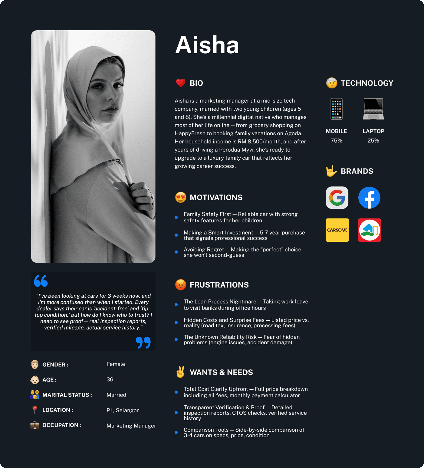
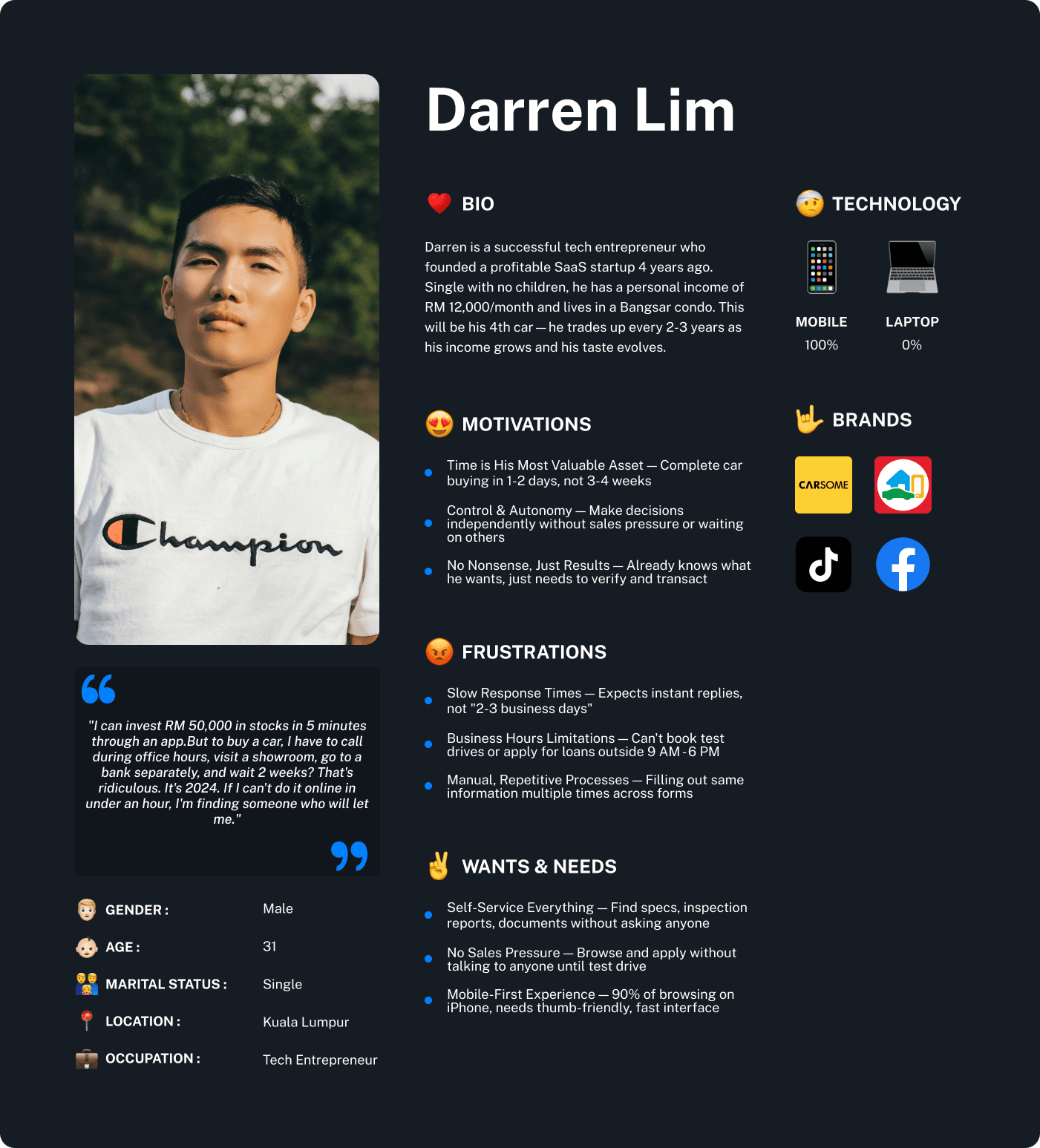
Based on 12 interviews and behavioral clustering analysis, I identified two primary personas representing distinct buying behaviors and needs:
Persona 1: “The Cautious Buyer” — 65% of Target Market
Persona 2: “The Fast-Paced Buyer” — 35% of Target Market
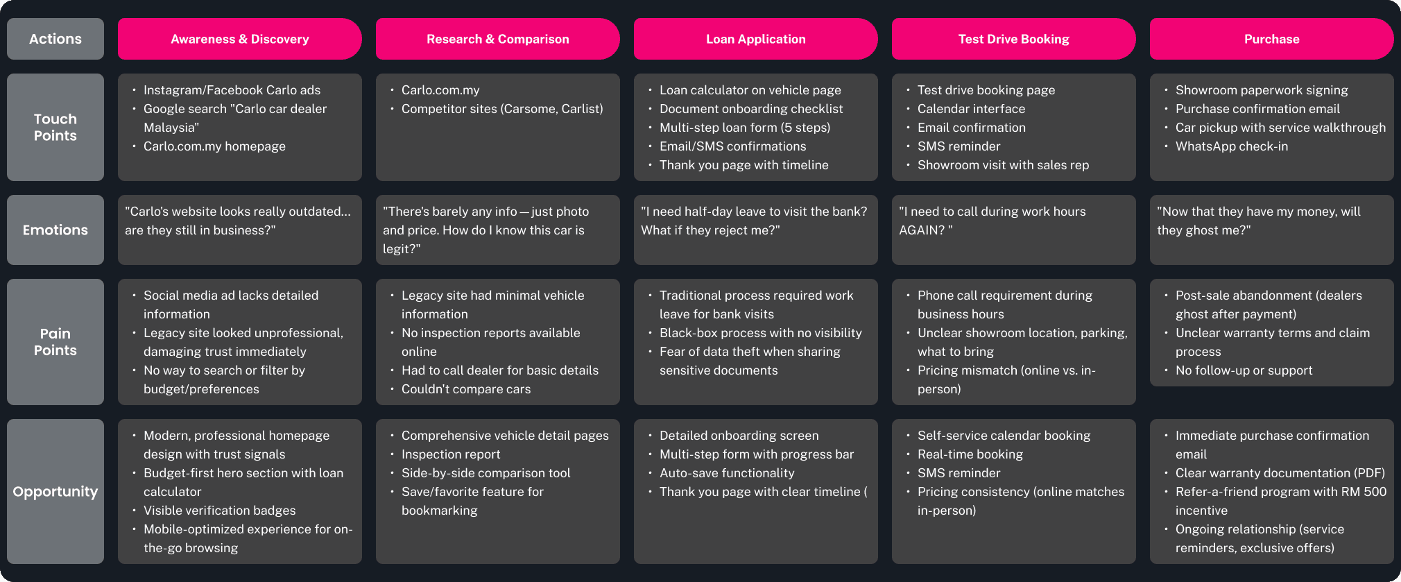
Customer Journey Map
Persona: 36-year-old marketing manager, married with 2 kids, upgrading from Perodua Myvi to luxury family car (RM 200K-250K)
User Flows
Outlining step-by-step how users would move through the website. This helped ensure a smooth and friendly experience. I deliberately separated these flows based on different user goals, so we could tailor the experience perfectly.
Goal: A user wants to know more about a specific car.
I focused on making sure all car details, photos, and specs were super easy to find and understand on the car’s individual page.

Goal: A user wants to request a loan.
This was a big one! I designed a clear, step-by-step process for the loan application to make it less daunting.

Goal: A user wants to schedule a test drive for a luxury car.
I made it simple to pick a date and time directly on the website, removing the need for phone calls back and forth.

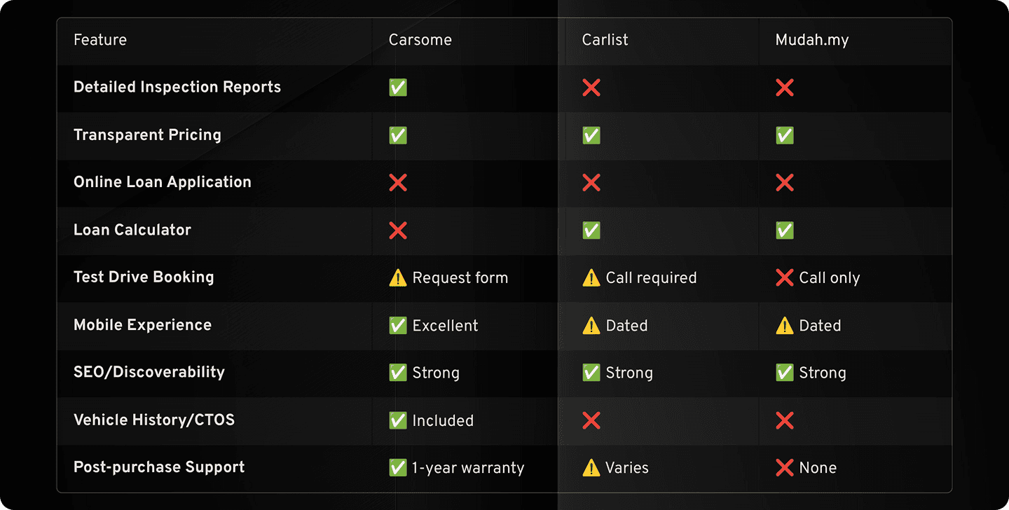
Competitive Analysis
I analyzed 3 major players in Malaysia’s online car marketplace to identify gaps Carlo could exploit:
Brand Foundation Workshop
Before designing interfaces, I facilitated a 90-minute workshop with Carlo’s leadership team to define brand attributes that would guide all design decisions:
Brand Attributes Framework
Attribute | Meaning for Design |
Culture: Adaptability | Modular design system that scales as features evolve |
Target: Affordability | Budget-first features, clear payment breakdowns |
Voice: Trustworthy | Security badges, third-party verification, transparent language |
Feeling: Empowerment | User controls the journey, no pressure tactics |
Impact: Positive Experience | Delight at every touchpoint, minimize cognitive load |
X-Factor: Personalization | AI-driven recommendations, save preferences |
Design Solutions
The Core Problem I Was Solving:
Traditional car buying in Malaysia was designed for a previous generation—one comfortable with phone calls during business hours and taking days off work for bank visits. But Carlo’s target audience was different: millennials aged 28-40 who represent Malaysia’s growing middle class with RM 5,000-8,000 monthly incomes and strong digital fluency.
The Millennial Expectation Gap:
This demographic grew up with TikTok, Grab, and Shopee. Their lived experience of everyday decisions and purchases:
Discovered products instantly through TikTok reviews, lives, and algorithm-driven feeds
Booked rides, food, and services on Grab in seconds with real-time tracking
Compared prices, read reviews, and checked out on Shopee with vouchers and same-day delivery
Expected: 24/7 access, transparent pricing, instant responses, seamless self-service experiences
My Solution Philosophy:
Rather than just “improving the website,” I reimagined the entire car buying journey as one continuous, transparent digital experience designed for millennial expectations all without leaving the platform. All without a single phone call. All on their own schedule—just like every other digital service they use. This wasn’t just about convenience—it was about respecting how millennials make purchase decisions: researching at midnight, comparing on mobile during commutes, and expecting instant answers.
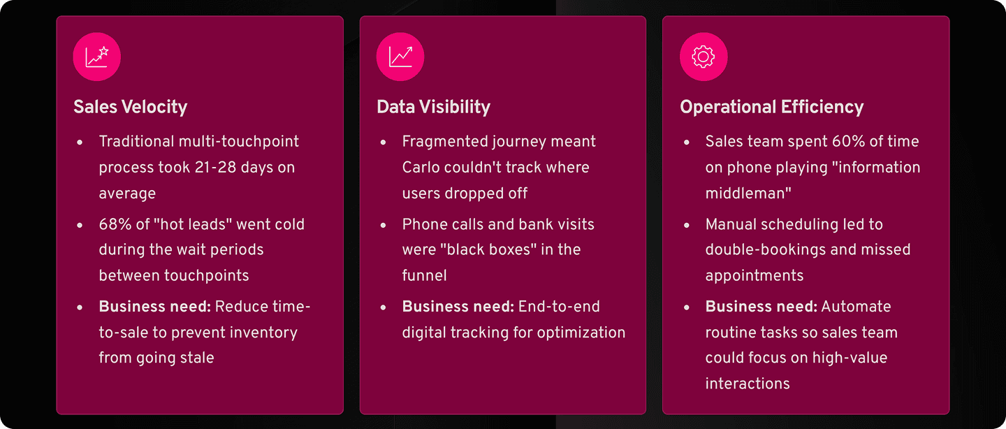
The End-to-End Digital Experience: Why It Mattered
Why Carlo Needed End-to-End Digital:
Design Principles
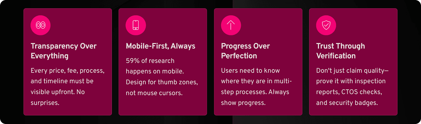
Based on research insights and brand attributes, I established four core principles:
Visual Design System
Translating Brand into Visuals: Typography and Color
Before diving into specific features, I laid the visual foundation, making sure the website’s look and feel aligned perfectly with Carlo’s brand. Our typography and color choices were directly based on the brand guidelines provided by Carlo and the brand attributes we defined earlier (like Trustworthy, Empowerment, and Personalization).
Color Palette:
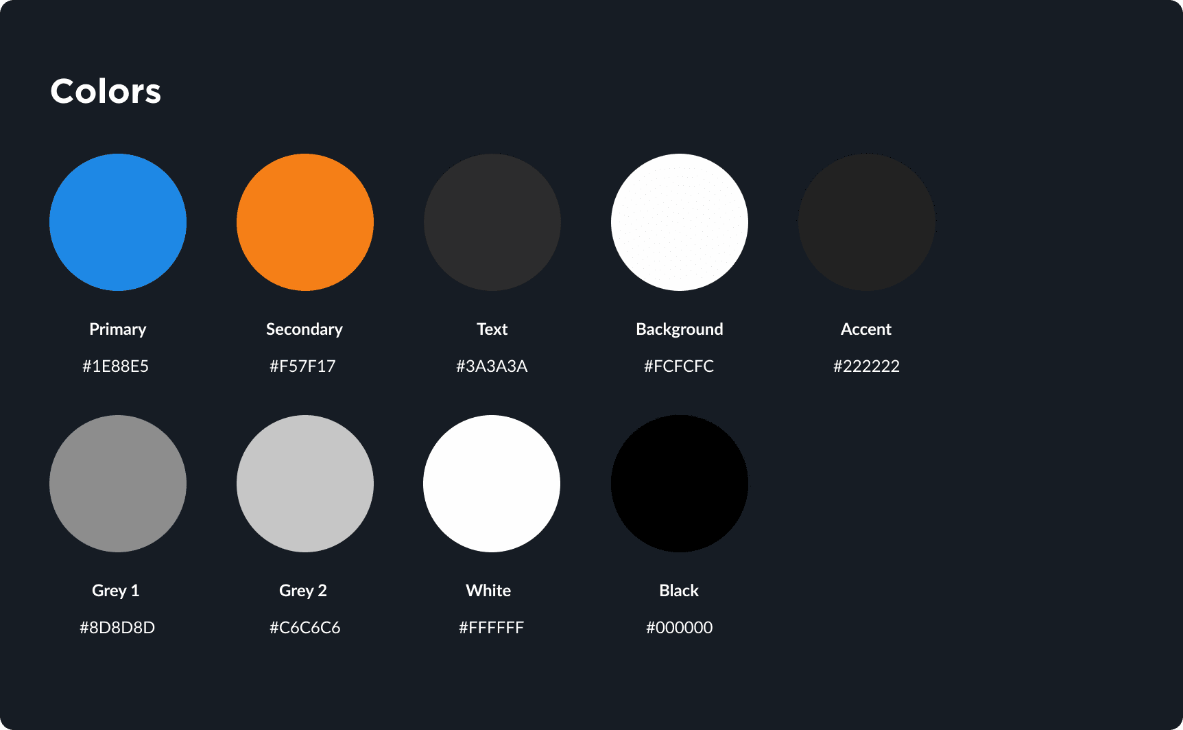
I chose a sophisticated color palette that balanced the luxury feel Carlo aimed for with the trustworthiness we wanted to convey. This included deep, rich tones (like a professional dark blue or charcoal) for stability and premium feel, combined with cleaner, brighter accents (perhaps a specific shade of gold or a crisp white) to highlight key information and create a sense of clarity and modern elegance. These choices were meant to instill confidence and make the user feel they were dealing with a high-end, reliable brand.
Typography:

For typography, I selected a combination of fonts that were both modern and highly readable. I opted for a clean, sans-serif font for body text to ensure ease of reading on all devices, especially mobile. For headlines and important calls-to-action, I used a slightly bolder or more distinctive font that still maintained a professional and trustworthy feel, reinforcing Carlo’s reliable voice. The goal was to make content easy to digest while visually elevating the brand experience.
Key Design Solutions
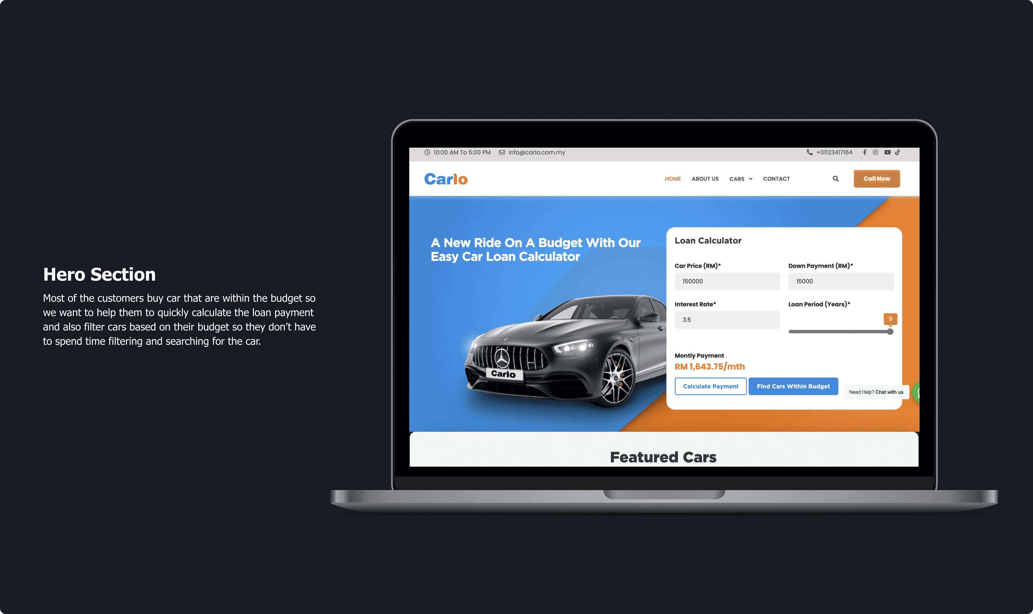
Solution #1: Budget-First Hero Section
Interactive hero section with two entry points:
Loan Calculator — Input desired monthly payment → See matching cars
Budget Filter — Select price range → View available inventory
Business Impact:
62% of users engaged with hero calculator (vs. 18% on traditional “Search” buttons)
Users who used calculator were 2.3x more likely to proceed to vehicle details
Reduced “Browse → Bounce” rate by 41%
Solution #2: Integrated Loan Application (With Trust-Building Elements)
In Malaysia’s car buying landscape, securing financing is the biggest barrier to purchase—not finding the right car. Research revealed critical pain points with the traditional offline loan process:
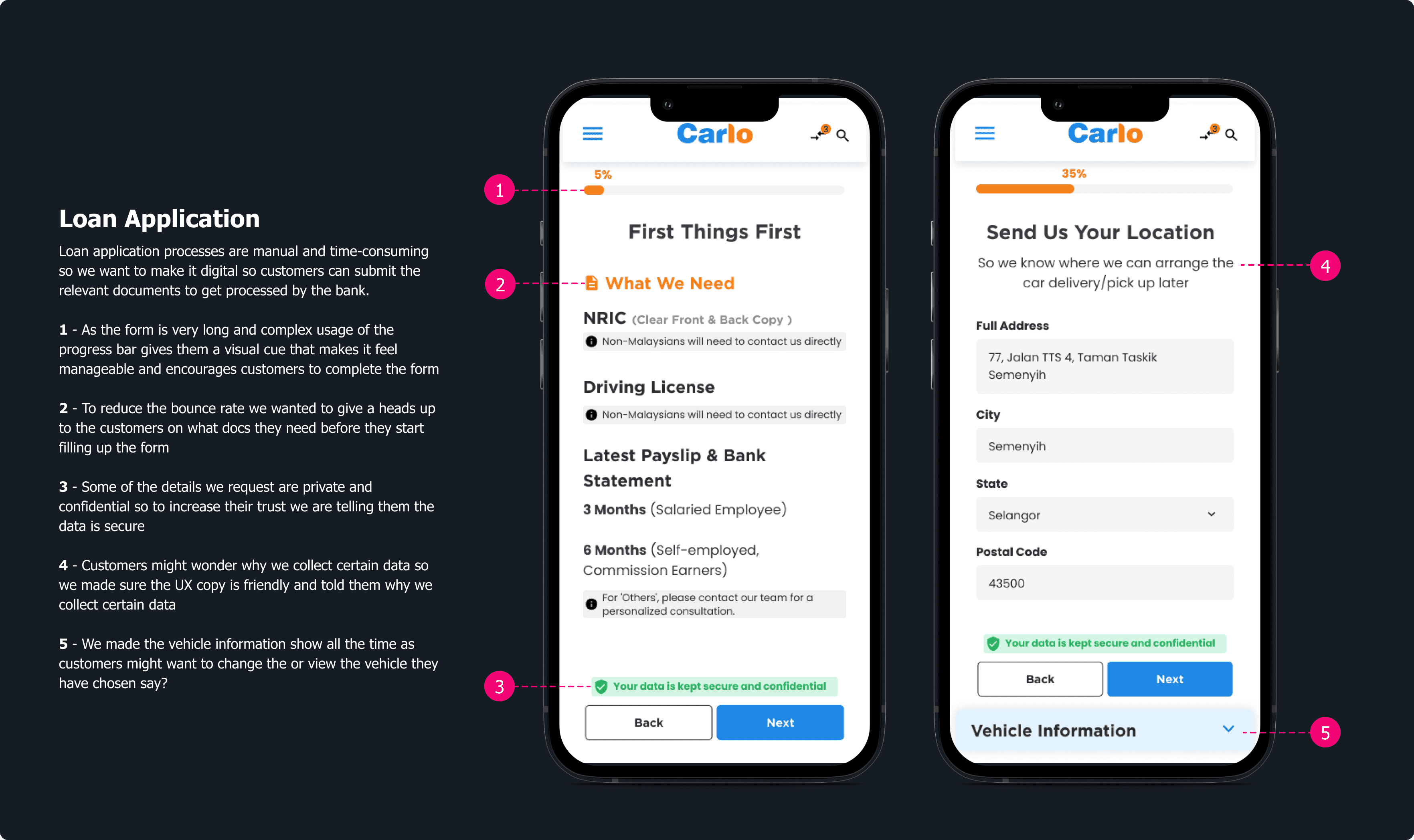
Business Impact:
Time Savings: 14 Days → 8 Minutes
67% completion rate (vs. 32% with traditional bank referrals)
45% of approved loans converted to test drives within 72 hours
RM 804,000 (67% of total RM 1.2M revenue) came through digital loan applications
Solution #3: Automated Test Drive Booking
Calendar-based booking interface with real-time availability
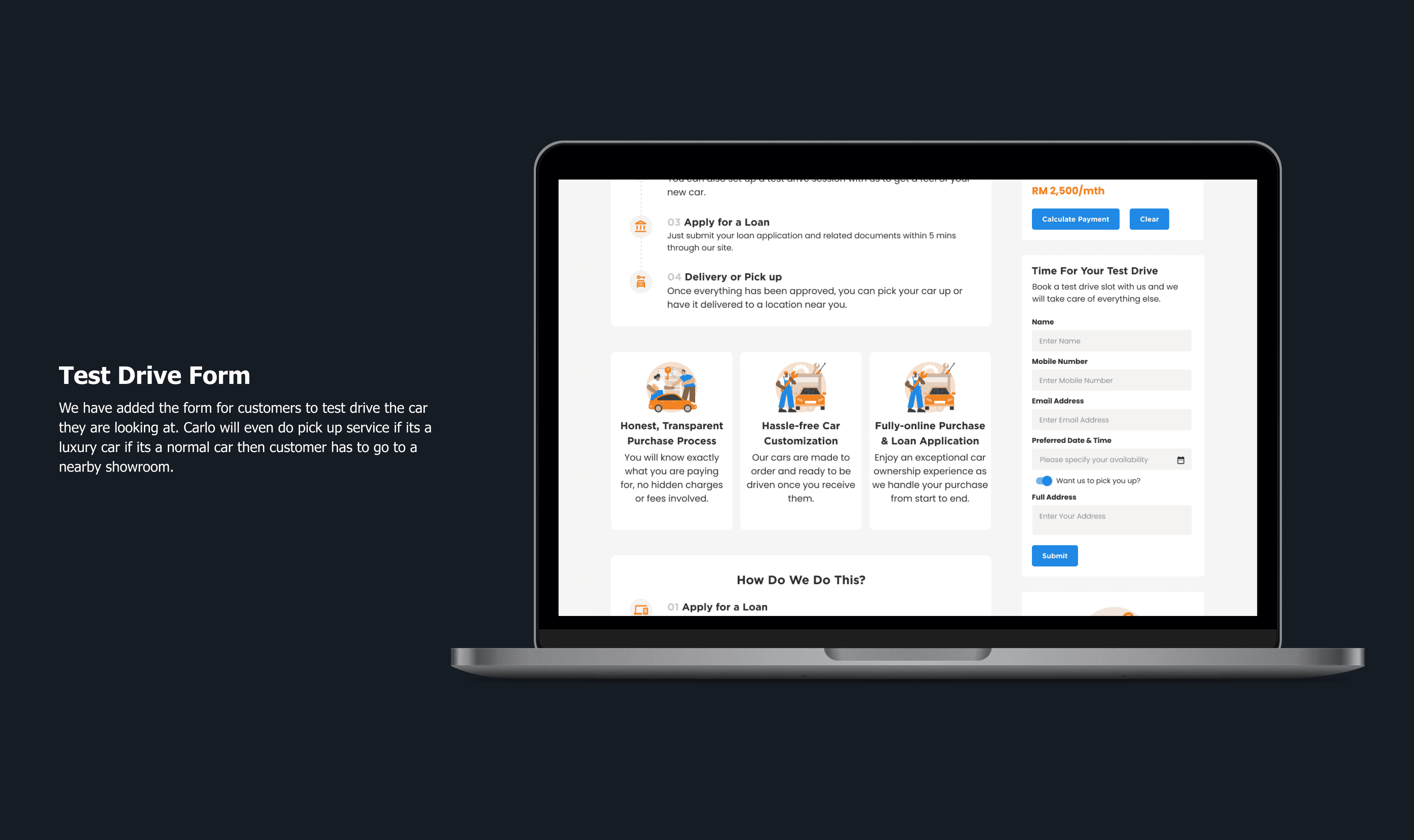
Business Impact:
92% booking completion rate (vs. 34% when phone call was required)
Zero double-bookings since launch
Reduced admin time by 15 hours/week
4.8/5 satisfaction rating for booking process
Solution #4: Post-Submission Clarity (Thank You Pages That Actually Help)
The Problem:
After submitting a loan application or booking a test drive, users were left wondering:
“Did it go through?”
“When will I hear back?”
“What if I need to change something?”
“Is my data really secure?”

Business Impact:
84% reduction in “where is my application?” support calls
4.7/5 satisfaction rating for post-submission experience
19% increase in return visits to browse more cars
Users with reference numbers were faster to resolve issues when they did call
Usability Testing & Iteration
Testing Methodology
Tool:
Maze (remote, unmoderated usability testing)
Participants:
16 users
Ages: 27-30
Mix: 60% Cautious Buyers, 40% Fast-Paced Buyers
Device split: 60% mobile, 40% desktop
All based in Klang Valley (Malaysia)
Test Missions:
Mission 1: Find a Mercedes CLA within RM 2,500/month budget
Mission 2: Apply for a car loan
Mission 3: Book a test drive for this Saturday
Mission 4: View the inspection report for a specific car
Mission 5: Compare two similar cars
Initial Testing Results

Overall Average: 85% task completion rate
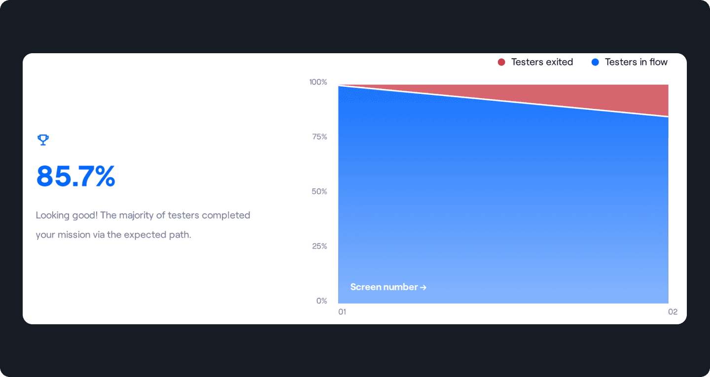
Three Issues Identified:
Too many optional fields → Confused what was mandatory
No save-for-later option → Users couldn’t pause and resume
Change #1 Mandatory Field Reduction
Audit of Original 32 Fields:
18 were marked “required” but actually optional for initial application
6 were redundant (asking same info twice)
8 were truly mandatory
My Solution:
Reduced to 9 core mandatory fields for initial submission
Moved “nice-to-have” fields to “Complete Your Profile Later” section
Added “Why we ask this” tooltips on sensitive fields
Change #2: Auto-Save & Resume
Form auto-saves every 30 seconds
Exit intent popup: “Save your progress? We’ll email you a link to continue.”
Saved applications expire after 7 days (for security)
Final Usability Metrics
After iteration and final testing:
Average satisfaction: 4.5/5
Net Promoter Score (NPS): +47
The Business Context
Malaysia’s Competitive Car Market
Malaysia has the second-highest car ownership rate in Asia with 535 cars per 1,000 people. The used car market alone is projected to reach US$34.47 billion by 2030, with 65% of all car transactions being pre-owned vehicles due to 30-50% cost savings.

The Digital Shift:
80% of Malaysians research cars online before buying (Google/TNS Study)
59% use mobile devices for research—and growing
60% of purchase decisions are influenced by Google Search
Despite this digital-first behavior, no platform offered a truly transparent, end-to-end online buying experience—from browsing to loan approval to test drive scheduling.
Carlo’s Unique Position
Carlo held the AP (Approval Permit) to import reconditioned luxury cars and sold through partnerships with new and used car dealers. This gave them access to a wide inventory, but they had a critical problem:
Their legacy website (Carlo.com.my) suffered from:
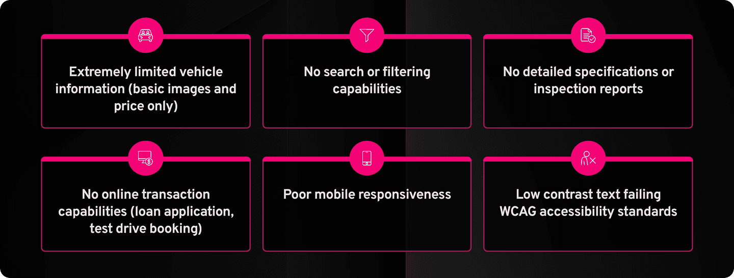
Their sales operation was fragmented:
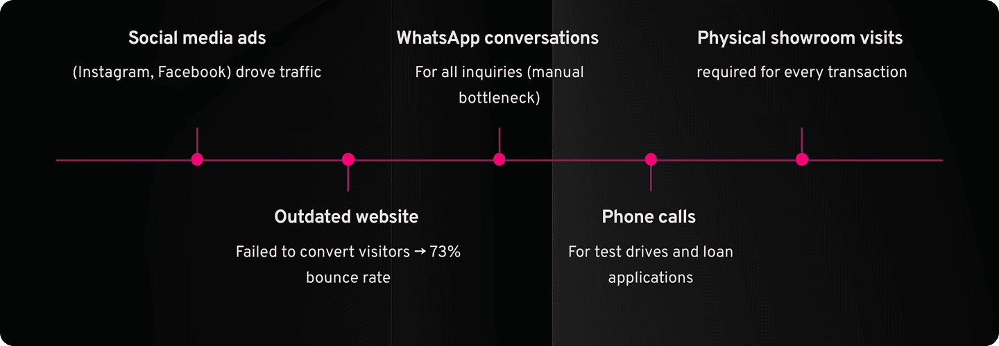
The result? High bounce rates, severe trust deficit, and lost sales to digitally mature competitors like Carsome who offered seamless online experiences.
The Problem
Why Malaysian Buyers Didn’t Trust Car Dealers
Through initial research and analysis of platforms like r/kereta (Malaysia’s car enthusiast subreddit), I identified a severe trust crisis:
The “Mudah.CON” Problem: Malaysian buyers are deeply skeptical of used car sellers due to:
Fake mileage readings (common complaint: “89% of users mentioned scam concerns”)
Misleading prices that change upon inquiry
Hidden accident history
Pressure sales tactics
The Fragmented User Journey
I mapped the existing buyer journey and identified critical friction points:
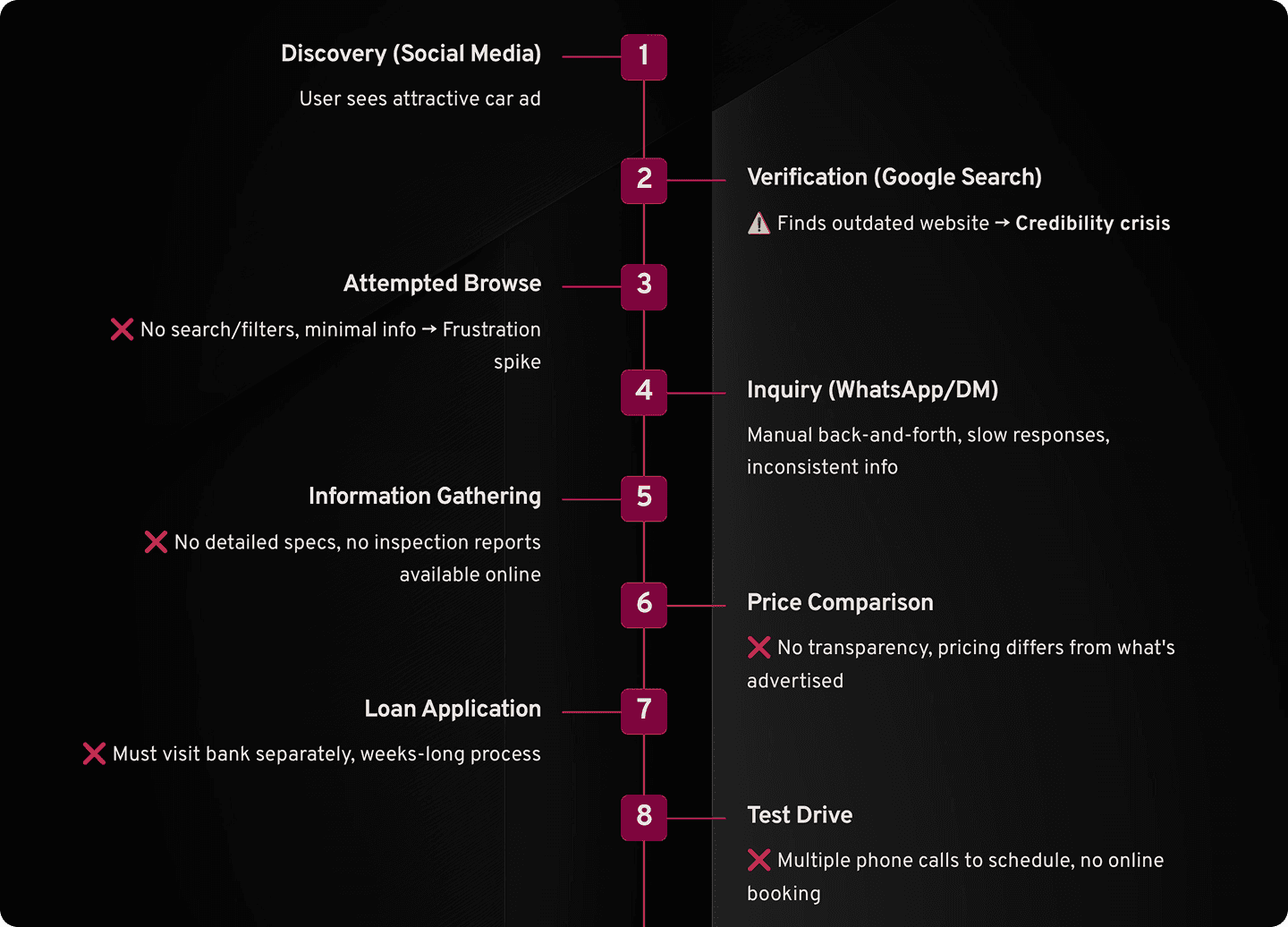
Legacy Website Audit: The Trust Destroyer
I conducted a comprehensive audit of the existing Carlo.com.my and identified critical issues that were actively driving away high-intent buyers:
Critical Issue #1: Discovery Paralysis

The Problem:
No search bar or filtering system whatsoever
No header navigation
Users had to manually scroll through a long, unorganized list of vehicles
No way to filter by make, model, year, price range, or any specification
User Impact:
“I wanted a Mercedes under RM 250K. I had to look at every single car manually. After 5 minutes I gave up and went to Carlist.”
Business Impact:
Estimated 41% of visitors bounced within first 2 minutes due to poor discoverability (GA Data)
Lost to competitors with functional search (Carsome, Carlist)
Critical Issue #2: The Transparency Gap
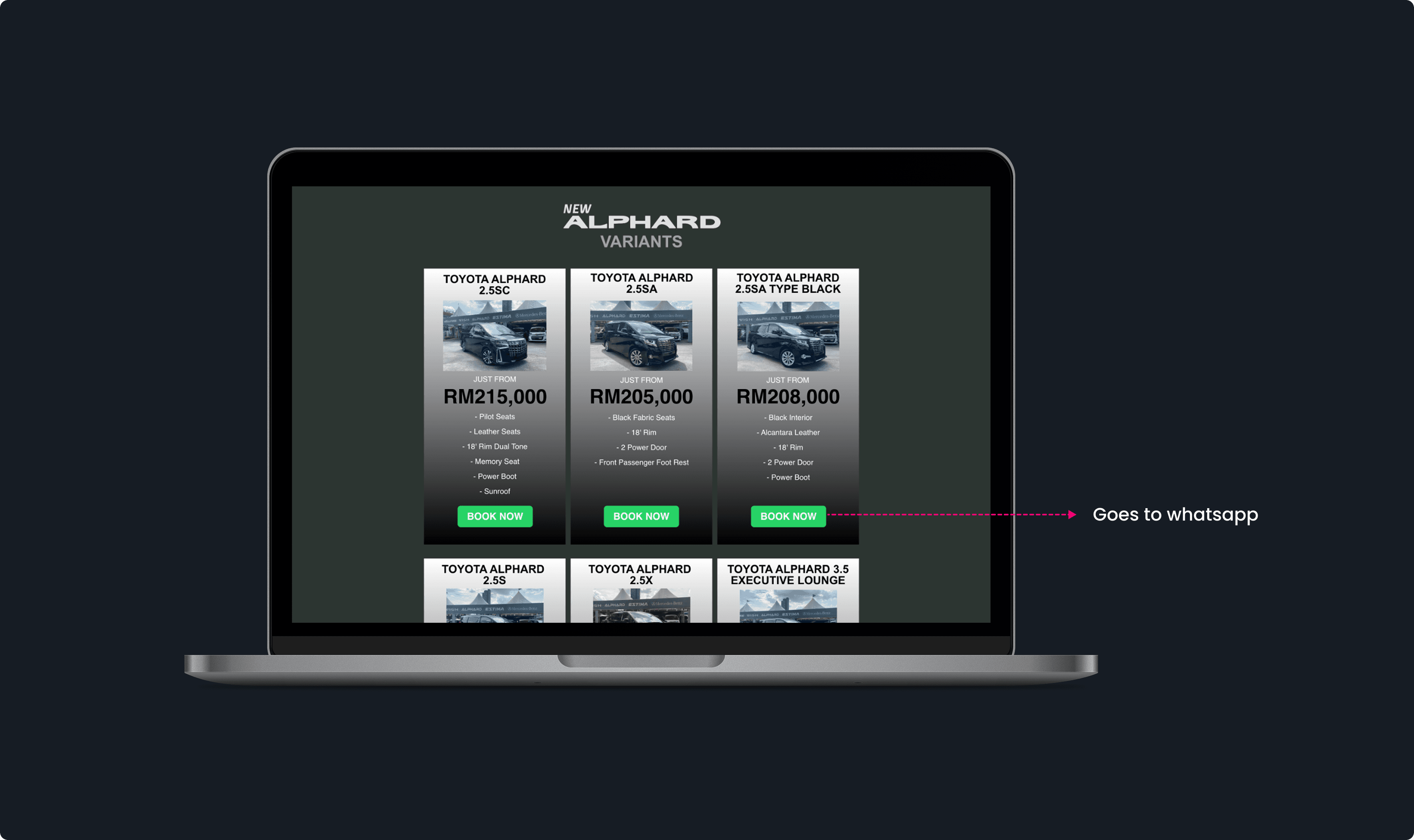
The Problem:
Vehicle listings showed only basic information: One image, model name, year, price
No detailed car details page (engine size, transmission type, features) . Book now opens whatsapp
No loan calculator to help users understand affordability
No monthly payment breakdown
Context:
In Malaysia’s used car market where mileage fraud is rampant (r/kereta discussions show 89% of users worry about fake readings), the absence of verification was a deal-breaker.
User Impact:
“Carlo’s listing just said ’Mercedes CLA 2017 - RM220K.’ That’s it. No mileage, no history, nothing. Meanwhile, Carsome shows a 175-point inspection report. Who would you trust?”
Business Impact:
Many users cited “lack of detailed information” as reason for not proceeding
Direct competitive disadvantage vs. Carsome’s transparent inspection reports
Users couldn’t self-qualify, requiring manual WhatsApp inquiries
Sales team overwhelmed
Critical Issue #3: Accessibility & Readability Failures
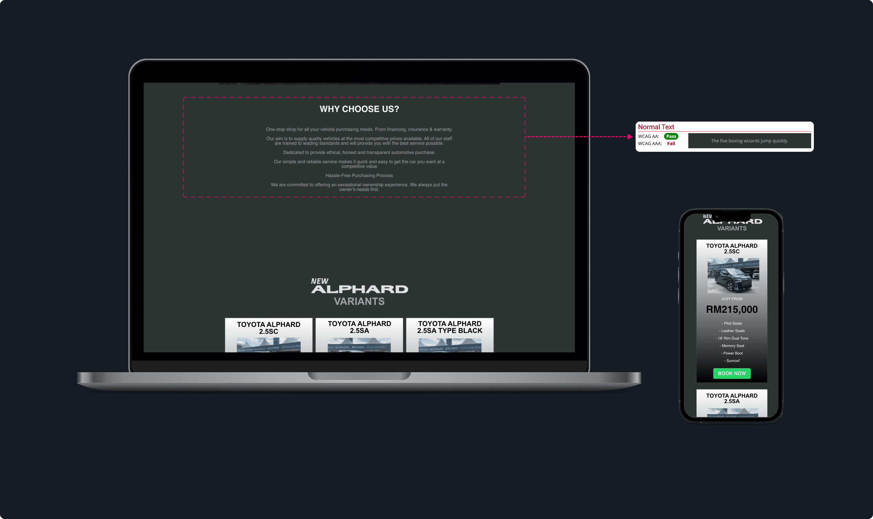
The Problem:
“Why Choose Us?” section used low-contrast gray text on dark charcoal background
Failed WCAG AAA contrast standards
Difficult to read on mobile, especially in bright sunlight
Small font sizes (11px body text on mobile)
Non-responsive design broke on various screen sizes
User Impact:
Mobile users had to pinch-zoom to read content
Created perception of unprofessional, outdated brand
Business Impact:
Lost opportunity to communicate Carlo’s unique advantages
Reinforced “outdated” perception that damaged trust
Accessibility violations could expose Carlo to legal risks
Problem Statement
Malaysian luxury car buyers—especially millennials aged 28–40 in their peak earning years—expect seamless, end-to-end digital experiences, yet were forced into a fragmented, offline-heavy purchase journey through Carlo’s outdated website and manual processes. The lack of search, transparent information, and online transaction capabilities created multiple drop-off points across calls, showroom visits, and bank appointments. As a result, qualified buyers abandoned Carlo for more digitally integrated competitors leading to significant lead leakage and lost revenue from a high-value demographic.
Launch & Results
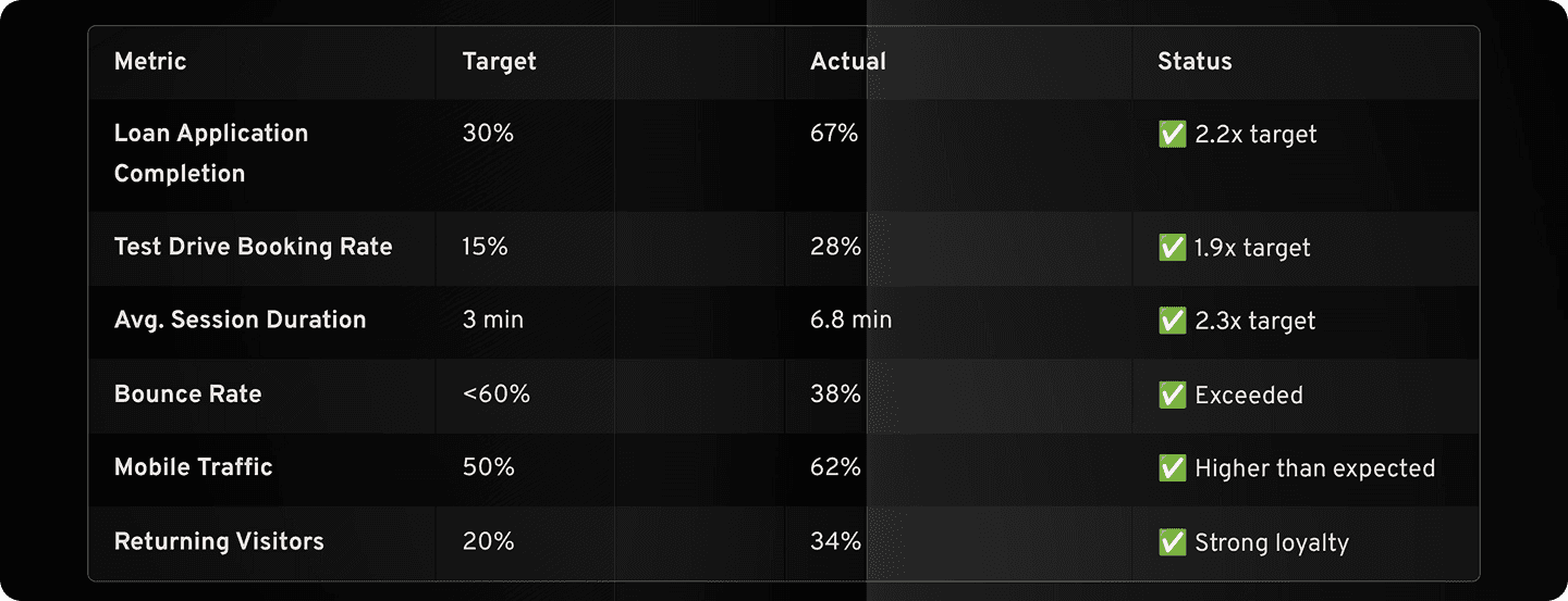
User Engagement Metrics
Operational Efficiency
84% reduction in “status check” inquiries (thank you pages + automated emails)
15 hours/week saved on manual test drive scheduling
Sales Team Feedback:
“The leads we get now are so much more qualified. They’ve already done their research, calculated their budget, and are ready to buy.” — Sales Manager
“We used to spend 30 minutes on the phone explaining the loan process. Now they come in with pre-approved applications.” — Loan Officer
What I Would Do Differently
More Granular A/B Testing
What Happened: We launched the full redesign all at once (big bang launch).
What I Wish I’d Done: Incremental feature rollout with A/B testing:
Version A: Homepage with budget calculator
Version B: Homepage with traditional search
Measure which drove higher loan application starts
Why This Matters: While overall results were strong, I don’t have definitive proof that specific features drove specific outcomes. Was it the loan calculator? The inspection reports? The combination?
What I’d Do Next Time:
Launch MVP with core features
A/B test major design decisions (hero section layout, form length, etc.)
Build data-driven case for each feature’s ROI
Final Reflection
This project transformed how I think about designing for trust in high-stakes transactions. When users are spending RM 100K + every design decision either builds or erodes confidence.
The biggest lesson:
Design isn’t just about making things beautiful or easy—it’s about understanding deep human anxieties and systematically addressing them through thoughtful, transparent experiences.
Carlo’s success wasn’t because we had the prettiest website. It was because we:
Listened deeply to user fears about scams and hidden costs
Designed for trust through third-party verification and radical transparency
Removed friction at every step of a complex buying journey
Measured relentlessly and iterated based on real user behavior
RM 1.2M in revenue wasn’t the goal—it was the outcome of designing an experience users finally felt safe trusting.